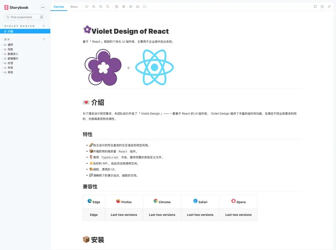
Violet Design
A high quality UI Toolkit built on React.
Overview:
The article discusses the introduction, features, compatibility, installation, and usage of the Violet Design, a UI component library based on React. It emphasizes the intuitive design, high-quality components, use of TypeScript, friendly API, beautiful UI, and clear documentation provided by Violet Design. The article also mentions the compatibility of Violet Design with different browsers.
Features:
- Intuitive and visually appealing design: Violet Design offers a self-designed, intuitive interaction language and visual style.
- Ready-to-use React components: The library provides high-quality React components that are ready to be used.
- TypeScript support: Violet Design is developed using TypeScript and provides complete type definition files.
- Flexible API: The library offers a friendly API that allows for flexible usage and customization.
- Beautiful UI: Violet Design aims to provide detailed and beautiful user interface elements.
- Clear documentation: The library includes a clear and comprehensive demonstration site and detailed documentation.
Summary:
The article introduces Violet Design, a UI component library based on React. It highlights the intuitive design, high-quality components, TypeScript support, flexible API, beautiful UI, and clear documentation provided by Violet Design. The article also mentions the compatibility of Violet Design with different browsers. Overall, Violet Design is presented as a comprehensive and visually appealing solution for designing and implementing UI components in React applications.
- React
React is a widely used JavaScript library for building user interfaces and single-page applications. It follows a component-based architecture and uses a virtual DOM to efficiently update and render UI components
- SCSS
SCSS is a preprocessor scripting language that extends the capabilities of CSS by adding features such as variables, nesting, and mixins. It allows developers to write more efficient and maintainable CSS code, and helps to streamline the development process by reducing repetition and increasing reusability.
- UI Kits & Components

A UI kit provides developers with a set of reusable components that can be easily integrated into a website or application. These components are pre-designed with consistent styling and functionality, allowing developers to save time and effort in the design and development process. UI kits can be either custom-built or third-party, and often include components for buttons, forms, typography, icons, and more.
- Eslint

ESLint is a linter for JavaScript that analyzes code to detect and report on potential problems and errors, as well as enforce consistent code style and best practices, helping developers to write cleaner, more maintainable code.
- Storybook
Storybook is a tool for developing and testing UI components in isolation. It provides a sandbox environment where you can experiment with different props and states to see how your component responds.
- Typescript

TypeScript is a superset of JavaScript, providing optional static typing, classes, interfaces, and other features that help developers write more maintainable and scalable code. TypeScript's static typing system can catch errors at compile-time, making it easier to build and maintain large applications.
- Webpack

Webpack is a popular open-source module bundler for JavaScript applications that bundles and optimizes the code and its dependencies for production-ready deployment. It can also be used to transform other types of assets such as CSS, images, and fonts.