Zog UI
This repository contains monorepo for React and Flutter UI library. (WIP - Alpha Release)
Overview
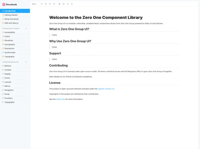
Zero One Group UI (Zero UI) is a modular, extensible, and styleable React components library provided by Zero One Group. It is based on Radix UI and Stitches.
Features
- Modular and extensible architecture
- Styleable React components
- Radix UI and Stitches integration
- Core UI library (Work in progress)
- Icons library (Published)
Step 1: Clone the repository
git clone [repository URL]
Step 2: Install dependencies
npm install
Step 3: Start using Zero UI
Import Zero UI components in your React application and start using them.
import { Button, Card, Input } from 'zero-ui';

function App() {
  return (
    <div>
      <Button>Click me</Button>
      <Card>
        <Input placeholder="Enter your name" />
      </Card>
    </div>
  );
}
Summary
Zero One Group UI (Zero UI) is a powerful and flexible React components library provided by Zero One Group. It offers a modular architecture, styleable components, and integration with Radix UI and Stitches. With ongoing development of the core UI library and a published icons library, Zero UI provides a comprehensive solution for building beautiful and functional user interfaces.
- Next.js
Next.js is a React-based web framework that enables server-side rendering, static site generation, and other powerful features for building modern web applications.
- React
React is a widely used JavaScript library for building user interfaces and single-page applications. It follows a component-based architecture and uses a virtual DOM to efficiently update and render UI components
- Radix UI
Radix Primitives is a low-level UI component library with a focus on accessibility, customization and developer experience. You can use these components either as the base layer of your design system, or adopt them incrementally.
- UI Kits & Components

A UI kit provides developers with a set of reusable components that can be easily integrated into a website or application. These components are pre-designed with consistent styling and functionality, allowing developers to save time and effort in the design and development process. UI kits can be either custom-built or third-party, and often include components for buttons, forms, typography, icons, and more.
- Eslint

ESLint is a linter for JavaScript that analyzes code to detect and report on potential problems and errors, as well as enforce consistent code style and best practices, helping developers to write cleaner, more maintainable code.
- TanStack

TanStack is a collection of high-quality, framework-agnostic libraries including TanStack Query for data fetching, TanStack Router for routing, TanStack Table for tables, and more. These tools provide powerful, type-safe solutions for common web development challenges.
- Typescript

TypeScript is a superset of JavaScript, providing optional static typing, classes, interfaces, and other features that help developers write more maintainable and scalable code. TypeScript's static typing system can catch errors at compile-time, making it easier to build and maintain large applications.