Precise UI
:triangular_ruler: React UI Component Library powered by ZEISS.
Overview
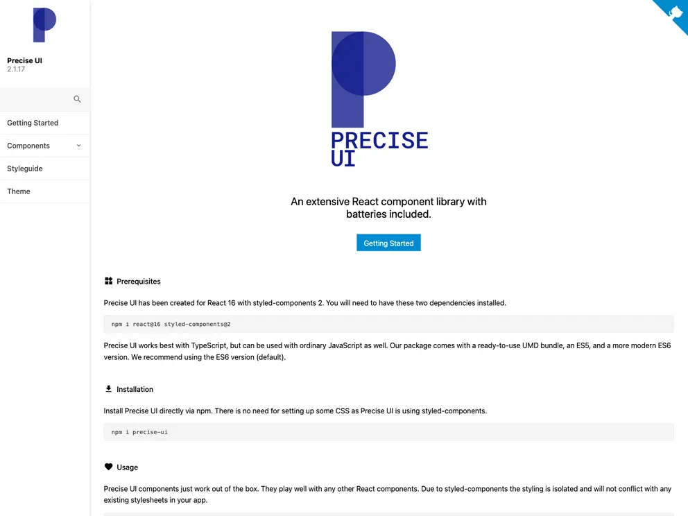
Precise UI is a React component library developed by ZEISS. It aims to simplify development by offering a comprehensive set of UI components that adhere to design specifications and provide ease of programming. The library includes both low-level and high-level design elements, allowing developers to quickly create repeatable UI designs. Precise UI also prioritizes flexibility, allowing for customization and theming. It can be easily integrated into frontend projects using npm or yarn.
Features
- Opinionated React component library: Precise UI is a complete opinionated React component library with minimal dependencies.
- Low-level and high-level design elements: The library includes both very low-level design elements as well as combined high-level design elements.
- Simplified development: Precise UI aims to simplify development by exposing components that satisfy design specifications and provide ease of programming.
- Customization and theming: The library offers flexibility in customization and theming, allowing developers to achieve full freedom in design.
- Demo page: The library includes a demo page illustrating all the components with their documentation, accessible at https://precise-ui.io.
Summary
Precise UI is a comprehensive React component library developed by ZEISS. It offers a range of UI components, both low-level and high-level, to simplify and expedite development. The library focuses on adhering to design specifications and providing ease of programming. It also allows for customization and theming, providing developers with the flexibility to achieve their desired UI designs. Precise UI can be easily integrated into frontend projects using npm or yarn.
- React
React is a widely used JavaScript library for building user interfaces and single-page applications. It follows a component-based architecture and uses a virtual DOM to efficiently update and render UI components
- Styled Components
Styled Components is a popular library for styling React components using CSS syntax. It allows you to write CSS in your JavaScript code, making it easier to create dynamic styles that are specific to each component.
- UI Kits & Components

A UI kit provides developers with a set of reusable components that can be easily integrated into a website or application. These components are pre-designed with consistent styling and functionality, allowing developers to save time and effort in the design and development process. UI kits can be either custom-built or third-party, and often include components for buttons, forms, typography, icons, and more.
- GitHub Pages

Gridsome is a Vue.js-based static site generator that makes it easy to build fast and flexible websites and applications by leveraging modern web technologies like GraphQL, Webpack, and hot reloading
- Typescript

TypeScript is a superset of JavaScript, providing optional static typing, classes, interfaces, and other features that help developers write more maintainable and scalable code. TypeScript's static typing system can catch errors at compile-time, making it easier to build and maintain large applications.
- Webpack

Webpack is a popular open-source module bundler for JavaScript applications that bundles and optimizes the code and its dependencies for production-ready deployment. It can also be used to transform other types of assets such as CSS, images, and fonts.