React Aria Components Tailwind Starter
Tailwind react aria components starter kits
Overview
The React Aria Components Tailwind Starter is a fantastic resource for developers looking to create a tailored design system in their projects. It combines the accessibility features of React Aria with the utility-first approach of Tailwind CSS, allowing users to build visually appealing and highly functional interfaces efficiently. This starter pack is perfect for those who have a vision for their UI design but want to save time on component development.
What sets this project apart is its focus on providing styled components that can be easily integrated into existing applications. By leveraging this starter, developers can focus more on customizing their applications rather than reinventing the wheel. It's not just a component library; it's an invitation to create a unique design experience.
Features
-
Styled Components: Offers a collection of pre-styled React Aria components that can be directly copied into your project, saving time on the design process.
-
Accessibility Focus: Built on React Aria, ensuring that all components are developed with accessibility in mind, making your applications usable for everyone.
-
Tailwind CSS Integration: Seamlessly integrates with Tailwind CSS, allowing developers to utilize its utility classes for responsive designs.
-
Customization Ready: Encourages customization of components, enabling developers to modify styles and functionality to fit their specific design needs.
-
Easy Setup: Simple installation process involving Tailwind CSS setup and dependency installation, making it accessible for developers of all levels.
-
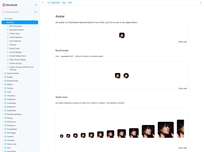
Storybook Exploration: Includes a storybook page to explore all available components interactively, making it easier to visualize and implement components in your project.
-
Community Inspired: Heavily inspired by established projects like the Tailwind Catalyst and Shadcn/uifluxui, drawing from successful practices in the developer community.
- React
React is a widely used JavaScript library for building user interfaces and single-page applications. It follows a component-based architecture and uses a virtual DOM to efficiently update and render UI components
- Vite
Vite is a build tool that aims to provide a faster and leaner development experience for modern web projects
- Tailwind
Tailwind CSS is a utility-first CSS framework that provides pre-defined classes for building responsive and customizable user interfaces.
- React Aria
Craft world-class accessible components with custom styles. Over 40 components with built-in behavior, adaptive interactions, top-tier accessibility, and internationalization out of the box, ready for your styles.
- Eslint

ESLint is a linter for JavaScript that analyzes code to detect and report on potential problems and errors, as well as enforce consistent code style and best practices, helping developers to write cleaner, more maintainable code.
- Postcss

PostCSS is a popular open-source tool that enables web developers to transform CSS styles with JavaScript plugins. It allows for efficient processing of CSS styles, from applying vendor prefixes to improving browser compatibility, ultimately resulting in cleaner, faster, and more maintainable code.
- Storybook
Storybook is a tool for developing and testing UI components in isolation. It provides a sandbox environment where you can experiment with different props and states to see how your component responds.
- Typescript

TypeScript is a superset of JavaScript, providing optional static typing, classes, interfaces, and other features that help developers write more maintainable and scalable code. TypeScript's static typing system can catch errors at compile-time, making it easier to build and maintain large applications.