Tw Animate Css
TailwindCSS v4.0 compatible replacement for `tailwindcss-animate`
Overview
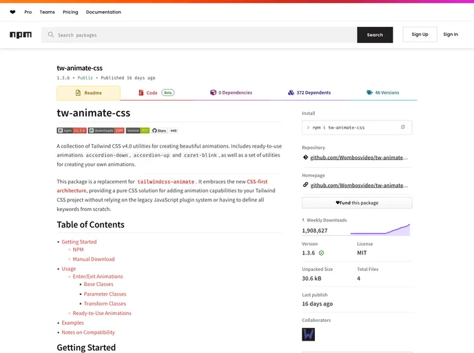
If you're looking to add visually appealing animations to your Tailwind CSS project, the tw-animate-css package is a fantastic solution. This collection of utilities, designed specifically for Tailwind CSS v4.0, allows developers to incorporate beautifully crafted animations like accordion-down, accordion-up, and caret-blink. Unlike the previous tailwindcss-animate plugin, this new package adopts a CSS-first approach, ensuring that you can enhance your UI without depending on legacy JavaScript solutions.
The ease of use and clear instructions make getting started a breeze, whether you choose to install via npm or through a manual download. Once integrated, you'll find that creating custom animations is straightforward and fits seamlessly within your existing Tailwind CSS workflow.
Features
- Pure CSS Solution: Embraces a CSS-first architecture, eliminating the need for JavaScript plugins and complex configurations.
- Ready-to-Use Animations: Includes built-in animations like
accordion-down,accordion-up, andcaret-blink, which can be implemented right out of the box. - Customizable Animation Parameters: Offers flexibility with parameter classes to define animation durations, timing functions, and delays tailored to your needs.
- Compatibility with Common Bundlers: Works effortlessly with esbuild, Vite, and likely other modern bundlers, simplifying your integration process.
- Clear Documentation: Provides straightforward usage instructions and examples, helping you quickly understand how to create and customize animations.
- Base Classes for Animations: Offers essential base classes required for managing enter/exit animations, ensuring that your animations behave as expected.
- Tailwind
Tailwind CSS is a utility-first CSS framework that provides pre-defined classes for building responsive and customizable user interfaces.
- Bits UI
Bits UI is a headless component library for Svelte that provides unstyled, accessible UI primitives. It powers shadcn-svelte and offers a foundation for building custom component libraries with full accessibility support in the Svelte ecosystem.
- Radix UI
Radix Primitives is a low-level UI component library with a focus on accessibility, customization and developer experience. You can use these components either as the base layer of your design system, or adopt them incrementally.
- Shadcn UI
Beautifully designed components that you can copy and paste into your apps. Accessible. Customizable. Open Source.