UI
The UI library for StudioCMS. Includes the layouts & components we use to build StudioCMS.
Overview
StudioCMS UI is an innovative library designed to enhance the development of applications using the StudioCMS platform. Built with Astro, this library streamlines the user interface design process, making it easier for developers to create intuitive and engaging applications. Whether you're a seasoned programmer or someone just diving into development, StudioCMS UI offers a robust set of tools to facilitate your work.
This library not only aims to improve productivity but also fosters a collaborative environment where community contributions and feedback are highly valued. With extensive documentation and a supportive community, StudioCMS UI is set to become a go-to resource for developers looking to create high-quality applications.
Features
-
NPM Version: Easily integrate the StudioCMS UI library within your projects using npm, ensuring all dependencies are managed efficiently.
-
Astro Built: Enjoy enhanced performance and modern capabilities thanks to the library's foundation in Astro, paving the way for faster and more efficient development.
-
Active Community Support: Engage with other developers via the StudioCMS Discord Server, where you can share ideas, ask questions, and collaborate on projects.
-
Contributions Welcome: The library encourages community involvement through bug reports, feature requests, and code contributions, promoting a culture of continuous improvement.
-
Detailed Documentation: Get started effortlessly with comprehensive documentation that guides you through installation, features, and examples.
-
Clear Contribution Guidelines: Developers interested in contributing can follow straightforward steps to submit their changes, including compliance with coding conventions and documentation updates.
-
MIT Licensed: The library is open-source under the MIT License, allowing for flexibility and freedom in usage and modification.
With these features, StudioCMS UI provides a solid foundation for developers looking to create engaging user interfaces efficiently.
- Astro
Astro is the all-in-one web framework designed for speed. Pull your content from anywhere and deploy everywhere, all powered by your favorite UI components and libraries.
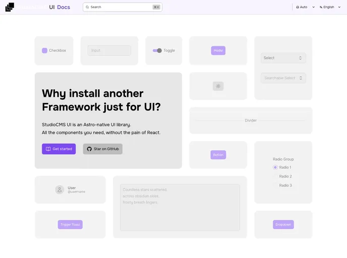
- UI Kits & Components

A UI kit provides developers with a set of reusable components that can be easily integrated into a website or application. These components are pre-designed with consistent styling and functionality, allowing developers to save time and effort in the design and development process. UI kits can be either custom-built or third-party, and often include components for buttons, forms, typography, icons, and more.
- Typescript

TypeScript is a superset of JavaScript, providing optional static typing, classes, interfaces, and other features that help developers write more maintainable and scalable code. TypeScript's static typing system can catch errors at compile-time, making it easier to build and maintain large applications.