Theme Switching With React And Styled Components
Build a React theme switcher app with styled-components
Overview
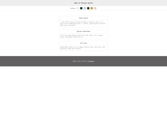
The article discusses how to build a React theme switcher app with styled-components. It explains the use of the ThemeProvider component in styled-components to set up multiple custom themes in React and easily switch between them. The tutorial guides the readers in creating styled components and multiple themes for the app, as well as implementing theme switching with a click of a button and saving the selected theme in local storage.
Features
- ThemeProvider: A wrapper component in styled-components that allows for easy setup of custom themes in React.
- Styled components: Provides a way to create reusable styled components for the app.
- Multiple themes: The ability to define and switch between different themes for the app.
- Theme switching: Implementation of a feature that allows users to switch between themes with a click of a button.
- Saving theme in local storage: Allows the selected theme to be saved and applied on subsequent visits.
Summary
The article provides a comprehensive guide on how to build a React theme switcher app using styled-components. It explains the benefits of using styled-components for theme switching and walks the readers through the process of implementing multiple themes, switching between them, and saving the selected theme in local storage. The tutorial is accompanied by a live demo and code snippets to aid in the understanding and application of the concepts discussed.
- React
React is a widely used JavaScript library for building user interfaces and single-page applications. It follows a component-based architecture and uses a virtual DOM to efficiently update and render UI components
- Styled Components
Styled Components is a popular library for styling React components using CSS syntax. It allows you to write CSS in your JavaScript code, making it easier to create dynamic styles that are specific to each component.