Flowbite Blazor
Blazor components built for Flowbite and Tailwind CSS
Overview
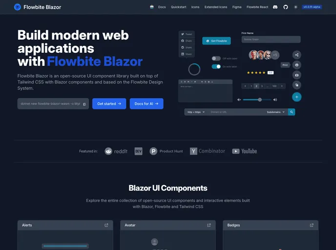
Flowbite Blazor is an innovative framework designed to enhance the development experience for Blazor applications. Currently in early development, it aims to provide a set of robust and flexible UI components, making it easier for developers to build sleek and responsive web applications. Given its early stage, users can expect some changes in APIs and packages, which reflects the dynamic nature of its ongoing development.
With an extensive library of components and icons, Flowbite Blazor is a promising choice for developers looking to leverage modern web technologies. The focus on scalability and ease of integration makes it an attractive option for those building rich user interfaces in .NET.
Features
- Core Icons: Includes 90 essential icons that cater to common UI needs, ensuring a polished look for applications.
- Comprehensive Components: A diverse range of components like Alerts, Buttons, Modals, and more, facilitating quicker development and creativity.
- Extended Icons: Access to over 200 additional icons that enhance the aesthetic appeal of applications without extra effort.
- Project Templates: Comes with .NET project templates specifically designed for Blazor WebAssembly, streamlining the setup process for new projects.
- AI-Supported Tools: Integration of AI-powered development tools aids in enhancing productivity and code quality.
- Ongoing Updates: As the framework is in early development, users can look forward to continuous improvements and new feature releases.
- Flowbite
Build websites even faster with components on top of Tailwind CSS. Start developing with an open-source library of over 600+ UI components, sections, and pages built with the utility classes from Tailwind CSS and designed in Figma.
- UI Kits & Components

A UI kit provides developers with a set of reusable components that can be easily integrated into a website or application. These components are pre-designed with consistent styling and functionality, allowing developers to save time and effort in the design and development process. UI kits can be either custom-built or third-party, and often include components for buttons, forms, typography, icons, and more.
- Postcss

PostCSS is a popular open-source tool that enables web developers to transform CSS styles with JavaScript plugins. It allows for efficient processing of CSS styles, from applying vendor prefixes to improving browser compatibility, ultimately resulting in cleaner, faster, and more maintainable code.