React Notifications Component
Delightful and highly customisable React Component to notify your users
Overview
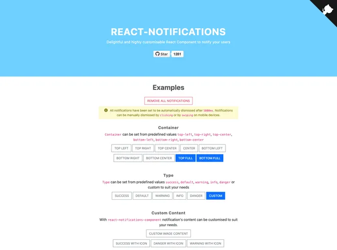
The React Notifications Component is a beautifully designed tool that makes notifying users a breeze. With a simple setup process and a plethora of customizable options, it allows developers to integrate notifications effortlessly into their applications. Whether you need a quick success alert or a warning, this component covers all standard notification types while also allowing for custom notifications tailored to your needs.
What sets this component apart is its responsiveness and touch support, ensuring notifications look great on any device. The ability to create stylish alerts without a complicated configuration process makes this library a go-to solution for developers who want to enhance user experience efficiently.
Features
- Touch Support: Notifications are user-friendly, supporting touch interactions for mobile devices.
- Responsive Notifications: Adapts to different screen sizes, ensuring visibility and accessibility across all devices.
- Standard and Custom Notification Types: Choose from predefined alert types or create your own for more personalized communication.
- Dismissable Notifications: Users can easily dismiss notifications through touch, click, or automatically after a timeout, providing a seamless interaction.
- Customizable Transitions: Utilize animations to enhance the visual appeal of notifications or use your own CSS for even more customization.
- Small Library Size: Lightweight design ensures minimal impact on application performance, allowing for quick loading times.
- Multiple Notification Containers: Offers various positioning options on the screen, including corners and centers, to suit different app layouts.
- Built-in API Methods: Simple methods like
addNotificationandremoveNotificationallow for straightforward management of notifications, reducing development time.
- React
React is a widely used JavaScript library for building user interfaces and single-page applications. It follows a component-based architecture and uses a virtual DOM to efficiently update and render UI components
- Bootstrap
Bootstrap is the most popular CSS Framework for developing responsive and mobile-first websites.
- SCSS
SCSS is a preprocessor scripting language that extends the capabilities of CSS by adding features such as variables, nesting, and mixins. It allows developers to write more efficient and maintainable CSS code, and helps to streamline the development process by reducing repetition and increasing reusability.
- Eslint

ESLint is a linter for JavaScript that analyzes code to detect and report on potential problems and errors, as well as enforce consistent code style and best practices, helping developers to write cleaner, more maintainable code.
- GitHub Pages

Gridsome is a Vue.js-based static site generator that makes it easy to build fast and flexible websites and applications by leveraging modern web technologies like GraphQL, Webpack, and hot reloading
- Typescript

TypeScript is a superset of JavaScript, providing optional static typing, classes, interfaces, and other features that help developers write more maintainable and scalable code. TypeScript's static typing system can catch errors at compile-time, making it easier to build and maintain large applications.
- Webpack

Webpack is a popular open-source module bundler for JavaScript applications that bundles and optimizes the code and its dependencies for production-ready deployment. It can also be used to transform other types of assets such as CSS, images, and fonts.