Splendor UI
A set of UI components for splendor-xzwhome. Built with Vue 3.
Overview
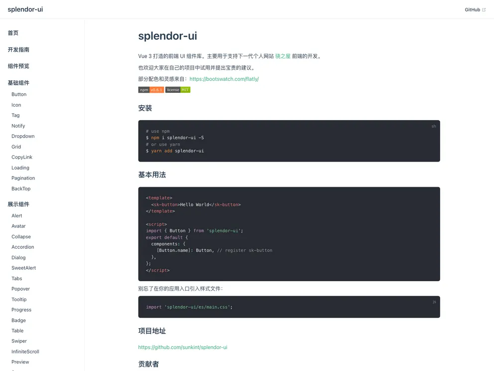
Splendor UI is a desktop UI component library built with Vue3 and TSX. It is designed for modern browsers and primarily used in the development of the frontend of the XNZH personal website. The library is released under the MIT license, allowing users to freely learn, modify, and use it.
Features
- Button: A component for buttons.
- Input: A component for input fields.
- Textarea: A component for multi-line text input fields.
- Icon: A component for displaying icons.
- Tag: A component for displaying tags.
- Notify: A component for displaying notifications.
- Dropdown: A component for creating dropdown menus.
- CopyLink: A component for copying links.
- Loading: A component for displaying loading spinners.
- Checkbox: A component for checkboxes.
- Radio: A component for radio buttons.
- Switch: A component for switches/toggles.
- Grid: A component for creating grid layouts.
- Collapse: A component for collapsing content.
- Accordion: A component for creating accordion menus.
- Pagination: A component for pagination.
- BackTop: A component for scrolling to the top of the page.
- Avatar: A component for displaying avatars.
- Alert: A component for displaying alerts/toast messages.
- Dialog: A component for displaying dialog/confirmation boxes.
- SweetAlert: A component for displaying sweet alerts.
- Popover: A component for creating popovers/tooltips.
- Tooltip: A component for tooltips.
- Progress: A component for displaying progress bars.
- Select: A component for dropdown/select menus.
- Badge: A component for displaying badges/labels.
- Tabs: A component for creating tabbed content.
- Table: A component for displaying tabular data.
- Swiper: A component for creating swipeable content.
- InfiniteScroll: A component for implementing infinite scrolling.
- Mention: A component for mentioning users or items.
- Preview: A component for previewing content.
- DatePicker: A component for selecting dates.
- Steps: A component for creating step-by-step processes.
- Upload: A component for uploading files.
- Slider: A component for sliders/carousels.
Summary
Splendor UI is a Vue3 and TSX-based UI component library for desktop applications. It aims to support the development of modern websites, particularly for the XNZH personal website frontend. The library offers a wide range of components from buttons and inputs to complex components like grids and sliders. It is released under the MIT license, allowing users to freely use and modify the library.
- Vitepress
VitePress is a static site generator designed for creating documentation websites. It offers a lightweight and fast development experience using Vue.js and Markdown, with features such as live-reload, theming, and customizable layout components.
- Vue
Vue.js is a lightweight and flexible JavaScript framework that allows developers to easily build dynamic and reactive user interfaces. Its intuitive syntax, modular architecture, and focus on performance make it a popular choice for modern web development.
- SCSS
SCSS is a preprocessor scripting language that extends the capabilities of CSS by adding features such as variables, nesting, and mixins. It allows developers to write more efficient and maintainable CSS code, and helps to streamline the development process by reducing repetition and increasing reusability.
- UI Kits & Components

A UI kit provides developers with a set of reusable components that can be easily integrated into a website or application. These components are pre-designed with consistent styling and functionality, allowing developers to save time and effort in the design and development process. UI kits can be either custom-built or third-party, and often include components for buttons, forms, typography, icons, and more.
- Postcss

PostCSS is a popular open-source tool that enables web developers to transform CSS styles with JavaScript plugins. It allows for efficient processing of CSS styles, from applying vendor prefixes to improving browser compatibility, ultimately resulting in cleaner, faster, and more maintainable code.
- Rollup

RollupJS is a popular and efficient JavaScript module bundler that takes the code from multiple modules and packages them into a single optimized file, minimizing the overall size of the application and improving its performance.
- Stylelint
Stylelint is a modern linter for CSS that helps you avoid errors and enforce consistent styling conventions. It provides rules for detecting errors and warnings, and can be configured to match your specific project's requirements.
- Typescript

TypeScript is a superset of JavaScript, providing optional static typing, classes, interfaces, and other features that help developers write more maintainable and scalable code. TypeScript's static typing system can catch errors at compile-time, making it easier to build and maintain large applications.