AlertKit
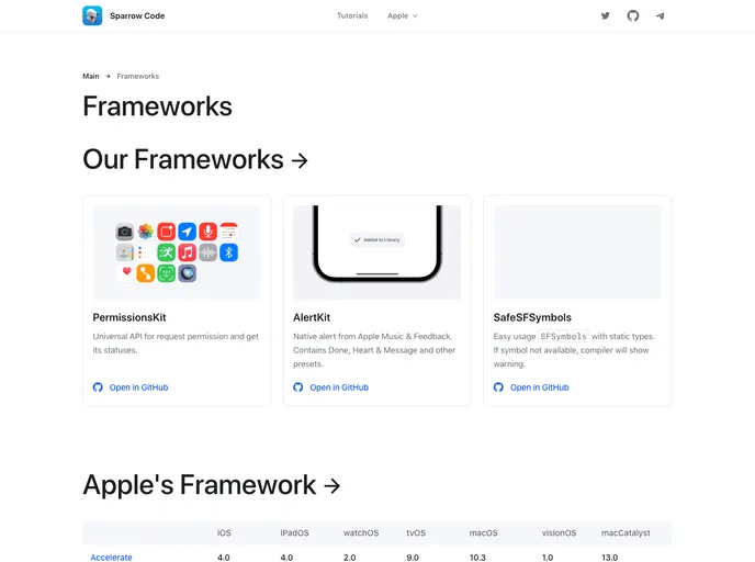
Native alert from Apple Music & Feedback. Contains Done, Heart & Message and other presets.
Overview
AlertKitPopup is a feature-rich library designed to recreate Apple's alerts as closely as possible. It includes a variety of alert styles, including Done, Heart, Error, and more. The library is compatible with Dark Mode and can be found in the AppStore after providing feedback or adding a song to your library in Apple Music.
Features
- Recreates Apple's alerts: AlertKitPopup aims to closely replicate Apple's alerts for a consistent user experience.
- Multiple alert styles: The library offers a range of styles, such as Done, Heart, Error, and more, to suit different requirements.
- Dark Mode support: AlertKitPopup is compatible with Dark Mode, ensuring alerts seamlessly integrate with the overall app design.
Summary
AlertKitPopup is a comprehensive library that allows developers to recreate Apple's alerts within their own apps. With support for multiple alert styles and compatibility with Dark Mode, it provides developers with the means to deliver a consistent and visually appealing user experience. The installation process is straightforward, with options available for both Swift Package Manager and CocoaPods.
- UI Kits & Components

A UI kit provides developers with a set of reusable components that can be easily integrated into a website or application. These components are pre-designed with consistent styling and functionality, allowing developers to save time and effort in the design and development process. UI kits can be either custom-built or third-party, and often include components for buttons, forms, typography, icons, and more.