Sodium UI
Sodium is a simple, modular and customizable web component library to build elegant and accessible UI pieces for your React Application.
Overview
Sodium UI is a simple, modular, customizable, and reactive web component library for developing elegant React apps. It aims to provide beautiful and accessible UI components for all your React needs.
Features
- React Components: Sodium UI offers a collection of React components that make the development process easier for React apps.
- Simple and Flexible Styling: Styling components in Sodium UI is straightforward and flexible, allowing for easy customization and handling.
- Reusable and Atomic Design Patterns: Sodium UI follows reusable and atomic design patterns during development, promoting a modular and organized approach to UI design.
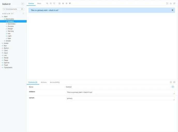
- Storybook-build Component Site: Sodium UI provides a Component Site, built with Storybook, where users, developers, and testers can explore and visualize the available components in isolation.
- Open Source and Contribution-friendly: Sodium UI is an open-source project that welcomes contributions from the community. Users can participate in bug fixing, proposing improvements, and setting up a development environment.
Summary
Sodium UI is a powerful and versatile web component library designed specifically for React apps. It offers a range of features, including ready-to-use React components, easy styling options, and adherence to reusable and atomic design patterns. With its Storybook-built Component Site, it provides a comprehensive visual guide to all available components. Furthermore, Sodium UI is an open-source project that encourages community contributions and provides a user-friendly installation process using npm.
- React
React is a widely used JavaScript library for building user interfaces and single-page applications. It follows a component-based architecture and uses a virtual DOM to efficiently update and render UI components
- Templates & Themes

A template or theme refers to a pre-designed layout or structure that provides a basic framework for building a specific type of application or website. It typically includes good design, placeholder content and functional features, allowing developers to customize and fill in the details according to their specific needs.
- UI Kits & Components

A UI kit provides developers with a set of reusable components that can be easily integrated into a website or application. These components are pre-designed with consistent styling and functionality, allowing developers to save time and effort in the design and development process. UI kits can be either custom-built or third-party, and often include components for buttons, forms, typography, icons, and more.
- GitHub Pages

Gridsome is a Vue.js-based static site generator that makes it easy to build fast and flexible websites and applications by leveraging modern web technologies like GraphQL, Webpack, and hot reloading
- Rollup

RollupJS is a popular and efficient JavaScript module bundler that takes the code from multiple modules and packages them into a single optimized file, minimizing the overall size of the application and improving its performance.
- Storybook
Storybook is a tool for developing and testing UI components in isolation. It provides a sandbox environment where you can experiment with different props and states to see how your component responds.
- Web Components

Web components provide a way to create reusable, encapsulated UI components using standard web technologies such as HTML, CSS, and JavaScript. They allow developers to create complex UI components that can be easily shared across multiple projects and frameworks. Web components are built using four main specifications: Custom Elements, Shadow DOM, HTML Templates, and ES Modules.