Components
Example Components (Built with Tonic)
Overview
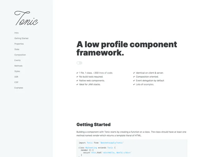
The Tonic Example Component Library is a bundle of example components designed to showcase the capabilities of the Tonic framework. With this library, developers can easily build and customize their own components using CSS variables.
Features
- Example Components: The library provides a collection of example components that demonstrate the functionality and versatility of the Tonic framework.
- Easy Installation: Installing the Tonic Example Component Library is as simple as installing the required dependencies.
- Theming Flexibility: Tonic utilizes CSS variables, allowing developers to easily theme components. This means that any CSS framework can be used without restrictions.
Summary
The Tonic Example Component Library offers developers a comprehensive collection of example components that showcase the capabilities of the Tonic framework. With easy installation and the ability to customize component themes using CSS variables, developers have the freedom to create their own unique designs without being restricted to any specific CSS framework.
- UI Kits & Components

A UI kit provides developers with a set of reusable components that can be easily integrated into a website or application. These components are pre-designed with consistent styling and functionality, allowing developers to save time and effort in the design and development process. UI kits can be either custom-built or third-party, and often include components for buttons, forms, typography, icons, and more.
- Web Components

Web components provide a way to create reusable, encapsulated UI components using standard web technologies such as HTML, CSS, and JavaScript. They allow developers to create complex UI components that can be easily shared across multiple projects and frameworks. Web components are built using four main specifications: Custom Elements, Shadow DOM, HTML Templates, and ES Modules.