Accessible_components
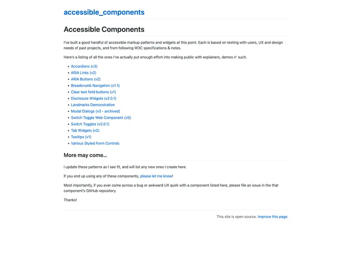
Listing of accessible components & patterns
Overview
The author of this content has developed a collection of accessible components for use in web development. These components have been tested with users and are designed based on past projects and adherence to W3C specifications. The author has made several of these components publicly available, with explanations and demos. They are open to feedback and bug reports from users.
Features
- Accordions (v3): A collapsible content widget for organizing information.
- ARIA Links (v2): Links that are accessible to users with disabilities using ARIA attributes.
- ARIA Buttons (v2): Buttons that are accessible to users with disabilities using ARIA attributes.
- Breadcrumb Navigation (v1.1): A navigation aid that shows the user's location within a website.
- Clear text field buttons (v1): Buttons that allow users to easily clear the content of text fields.
- Disclosure Widgets (v2.0.1): Widgets that reveal or hide additional content when interacted with.
- Landmarks Demonstration: A demonstration of the use of landmark roles in web development.
- Modal Dialogs (v3): Overlays that focus attention on a specific interaction or task.
- Switch Toggle Web Component (v0): A web component for toggle switches.
- Switch Toggles (v2.0.1): Toggle switches for turning options on or off.
- Tab Widgets (v2): Tabbed interfaces for organizing content.
- Tooltips (v1): Small pop-up windows that provide additional information when hovered over.
- Various Styled Form Controls: Stylish form controls for enhanced user experience.
Summary
In summary, the author has developed a range of accessible components for web development, including accordions, navigation aids, toggle switches, and more. These components have been extensively tested and follow W3C specifications. They can be easily installed and customized for use in various projects. The author welcomes feedback and bug reports to improve the components.
- UI Kits & Components

A UI kit provides developers with a set of reusable components that can be easily integrated into a website or application. These components are pre-designed with consistent styling and functionality, allowing developers to save time and effort in the design and development process. UI kits can be either custom-built or third-party, and often include components for buttons, forms, typography, icons, and more.