Rustic UI Components

React component library for crafting user-friendly and engaging conversational experiences
Overview
The UI Components for Rustic AI is a meticulously curated collection of reusable components that empower developers to construct interactive and versatile chat interfaces. With a keen focus on multimodal functionalities, this library is designed to cater to a variety of communication needs, whether it’s developing chatbots, virtual assistants, or other communication platforms. It promises to enrich user experiences by providing the essential building blocks needed for creating engaging interactions.
What sets Rustic UI Components apart is their ease of integration and adaptability to diverse projects. Developers can rely on this library to enhance their applications while enjoying the flexibility of a comprehensive toolkit. Additionally, with its availability on Figma, users can explore sophisticated design insights that guide effective UI construction.
Features
-
Comprehensive Component Library: Offers a wide range of reusable components tailored for various chat functionalities.
-
Multimodal Interfaces: Specifically designed to support interactive experiences across different communication platforms, including chatbots and virtual assistants.
-
Ease of Integration: Built with developers in mind, allowing for straightforward implementation into existing projects.
-
Figma Accessibility: Available on Figma, granting users the ability to delve into the designs and understand the UI layout intricacies.
-
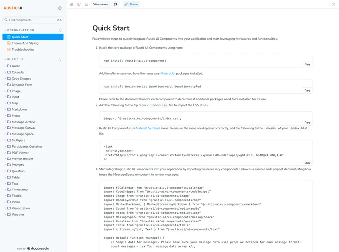
Robust Documentation: Comprehensive resources in Storybook, including a Theme and Styling guide for seamless usage.
-
Local Build Option: Provides guidance for developing the UI components locally, allowing for customization based on project needs.
-
Community Contributions: Welcoming contributions from developers looking to enhance the component library, supported by clear guidelines in the documentation.
-
MIT License: The project is licensed under the MIT License, ensuring that users can freely adapt and utilize the components in their projects.

- React
React is a widely used JavaScript library for building user interfaces and single-page applications. It follows a component-based architecture and uses a virtual DOM to efficiently update and render UI components
- Material UI
material-ui adds classes to Tailwind CSS for all common UI components. Classes like btn, card, etc. This allows us to focus on important things instead of making basic elements for every project.
- Storybook
Storybook is a tool for developing and testing UI components in isolation. It provides a sandbox environment where you can experiment with different props and states to see how your component responds.
- Typescript
TypeScript is a superset of JavaScript, providing optional static typing, classes, interfaces, and other features that help developers write more maintainable and scalable code. TypeScript's static typing system can catch errors at compile-time, making it easier to build and maintain large applications.
- Webpack
Webpack is a popular open-source module bundler for JavaScript applications that bundles and optimizes the code and its dependencies for production-ready deployment. It can also be used to transform other types of assets such as CSS, images, and fonts.