Astro
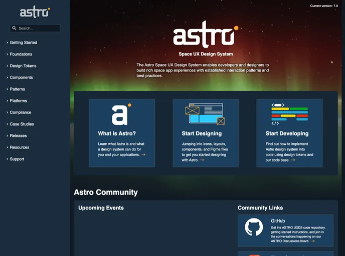
Astro UXDS is a collection of guidelines, patterns and components for designing space-based user interface applications.
Overview:
Built With Stencil, the Astro UXDS Web Component and CSS libraries offer a foundation for creating space app experiences and custom applications on the web. These libraries prioritize current web development best practices, with web components designed to be platform-agnostic, easily implementable or extendable in existing projects, and generic by default. Support for these libraries can be accessed through GitHub discussions or by emailing support@astrouxds.com.
Features:
- Astro UXDS Web Components: Provides a set of web components built in Stencil for building interactive web experiences.
- Astro Web Components for React: Wrap Astro Web Components for use in React projects.
- Astro Web Components for Angular: Wrap Astro Web Components for use in Angular projects.
- Migration Guide: Resource available for upgrading from Astro 6.0 to Astro 7.0.
- Release Strategy: Details a schedule of updates, with minor and patch updates every two weeks and major updates twice a year.
Summary:
Built with Stencil, the Astro UXDS Web Component and CSS libraries provide components tailored for creating advanced web experiences. These libraries offer platform-agnostic, easy-to-implement components and come with comprehensive documentation and support channels. With a structured release strategy and migration guide, developers can utilize Astro Web Components effectively in their projects.
- Web Components

Web components provide a way to create reusable, encapsulated UI components using standard web technologies such as HTML, CSS, and JavaScript. They allow developers to create complex UI components that can be easily shared across multiple projects and frameworks. Web components are built using four main specifications: Custom Elements, Shadow DOM, HTML Templates, and ES Modules.