Xstate Sample Kit
Sample or starter kit for developing web applications with reactjs, xstate, typescript, xstate/test, storybook, typedoc, fp-ts, and other libraries.
Overview
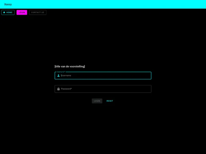
Xassy is a project that has been bootstrapped with Create React App. It is a versatile theme that offers a range of features for web developers.
Features
- Development mode: Xassy allows you to run the app in the development mode, enabling you to make edits and see the changes in the browser in real-time.
- Unit testing: The theme provides a unit test runner in the interactive watch mode, making it easy to test your code.
- End-to-end testing: Xassy also offers an end-to-end test runner, allowing you to perform comprehensive tests on your application.
- Production build: You can build your app for production using Xassy, which optimizes the build for the best performance, including minifying and including hashes in the filenames.
- Storybook component library: Xassy includes a storybook component library, which enables you to view and interact with your components in a separate browser window.
- Documentation generation: With Xassy, you can easily generate documentation for your code using Typedoc. The generated files are put in the docs folder.
Summary
Xassy is a powerful theme for React applications. With its various features, including development mode, unit testing, end-to-end testing, production build, storybook component library, and documentation generation, Xassy offers a comprehensive solution for web developers. Its ease of installation makes it accessible to developers of all levels.
- React
React is a widely used JavaScript library for building user interfaces and single-page applications. It follows a component-based architecture and uses a virtual DOM to efficiently update and render UI components
- SCSS
SCSS is a preprocessor scripting language that extends the capabilities of CSS by adding features such as variables, nesting, and mixins. It allows developers to write more efficient and maintainable CSS code, and helps to streamline the development process by reducing repetition and increasing reusability.
- Styled Components
Styled Components is a popular library for styling React components using CSS syntax. It allows you to write CSS in your JavaScript code, making it easier to create dynamic styles that are specific to each component.
- GitHub Pages

Gridsome is a Vue.js-based static site generator that makes it easy to build fast and flexible websites and applications by leveraging modern web technologies like GraphQL, Webpack, and hot reloading
- Storybook
Storybook is a tool for developing and testing UI components in isolation. It provides a sandbox environment where you can experiment with different props and states to see how your component responds.
- Typescript

TypeScript is a superset of JavaScript, providing optional static typing, classes, interfaces, and other features that help developers write more maintainable and scalable code. TypeScript's static typing system can catch errors at compile-time, making it easier to build and maintain large applications.