Component Library
A reusable component library made with React.
Overview:
The Component Library is a collection of reusable components created as part of Scrimba's Advanced React course. The goal of this library is to provide practice in using compound components, useContext, custom hooks, and Render Props. The library includes various components and features that can be used to build web applications.
Features:
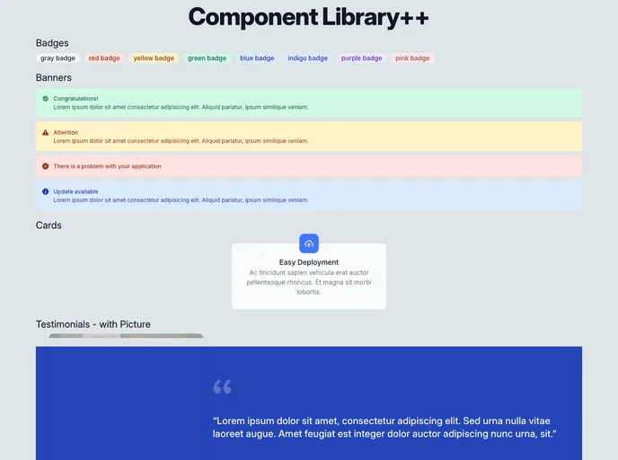
- Badge: A component for displaying badges or labels.
- Banner: A component for showing banners or alerts.
- Card: A reusable card component.
- Text Component: The Card and Banner components use the same Text component and change its style depending on the parent.
- Testimonial: A component for displaying testimonials.
- Tooltip: A component for displaying tooltips in web applications.
- Toast: A component for showing toast messages. The library allows multiple toasts to stack up and includes an X button to close toasts.
Summary:
The Component Library is a collection of reusable components created for practicing advanced React concepts. It includes components like Badge, Banner, Card, Text, Testimonial, Tooltip, and Toast. The library can be easily installed and used in any React application to enhance its functionality and user experience.