Elements
Design kit for Avail rental management software
Overview:
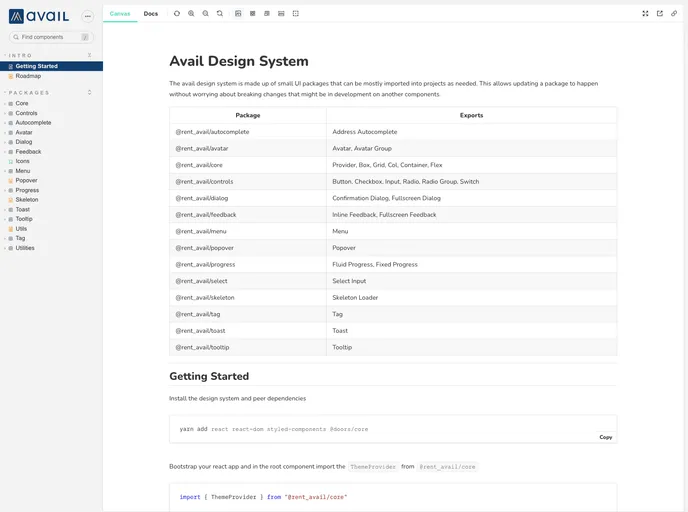
The Avail Design Kit is a collection of components that are designed to be composable, extendable, and usable. It offers a set of components that can be easily implemented in various projects. The kit also provides documentation and guidelines for developers to easily set up and customize the components to meet their specific needs.
Features:
- Composable: The Avail Design Kit components are designed to be easily combined with each other to create complex UI elements.
- Extendable: Developers can easily extend the functionality of the components by adding their own custom code and styles.
- Usable: The components in the kit are designed with a focus on usability, ensuring a seamless user experience.
Summary:
The Avail Design Kit is a comprehensive set of components that aims to provide developers with a flexible and efficient solution for building user interfaces. With its composable and extendable nature, developers can easily create complex UI elements while maintaining a high level of usability. By following the installation guide and utilizing the provided documentation, developers can seamlessly integrate the components into their projects and extend them as needed.
- React
React is a widely used JavaScript library for building user interfaces and single-page applications. It follows a component-based architecture and uses a virtual DOM to efficiently update and render UI components
- Styled Components
Styled Components is a popular library for styling React components using CSS syntax. It allows you to write CSS in your JavaScript code, making it easier to create dynamic styles that are specific to each component.
- UI Kits & Components

A UI kit provides developers with a set of reusable components that can be easily integrated into a website or application. These components are pre-designed with consistent styling and functionality, allowing developers to save time and effort in the design and development process. UI kits can be either custom-built or third-party, and often include components for buttons, forms, typography, icons, and more.
- Typescript

TypeScript is a superset of JavaScript, providing optional static typing, classes, interfaces, and other features that help developers write more maintainable and scalable code. TypeScript's static typing system can catch errors at compile-time, making it easier to build and maintain large applications.