Patternplate
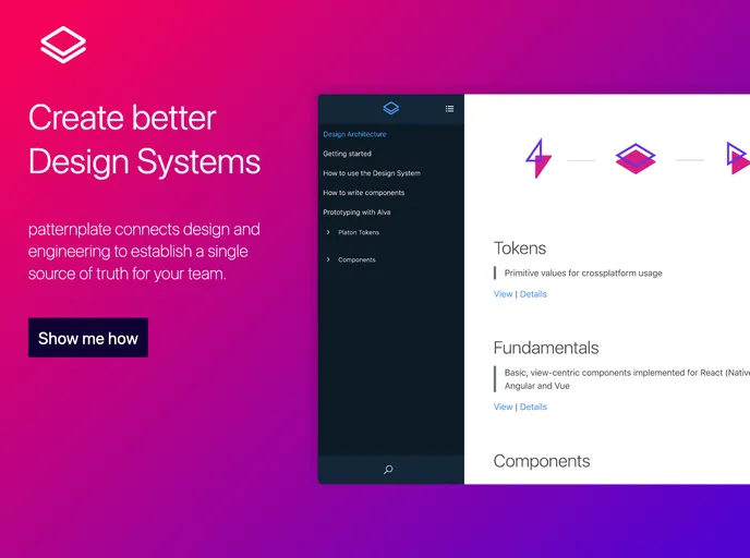
patternplate connects design and engineering to establish a single source of truth for your team.
Overview
This is a product analysis of the patternplate mono-repository documentation and development interface for component libraries. patternplate is a framework independent platform that allows users to bring design documents to life with real components. It offers a powerful search and meta data system, making it easy to find and manage components within the library. In addition, patternplate provides tools for users to contribute to the development and improvement of the platform.
Features
- Framework independent: patternplate can be used with any framework or technology stack.
- Real component integration: Users can bring design documents to life by integrating real components.
- Powerful search and meta data system: patternplate offers a search functionality and an efficient meta data system for easy component management.
- Contribute to patternplate: Users have the ability to contribute to the development and improvement of patternplate.
- Publish a release: The platform enables users to publish releases of their component libraries.
- Code of Conduct: patternplate expects everyone to follow their Code of Conduct to build an open and welcoming environment.
- License: All @patternplate packages are released under the MIT license.
Summary
The patternplate mono-repository provides a documentation and development interface for component libraries. With its framework independence, users can integrate real components into their design documents. The platform offers a powerful search and meta data system for efficient component management. Users can contribute to the development of patternplate and publish releases of their own component libraries. The platform promotes an open and welcoming environment through its Code of Conduct. All packages in @patternplate are released under the MIT license.
- React
React is a widely used JavaScript library for building user interfaces and single-page applications. It follows a component-based architecture and uses a virtual DOM to efficiently update and render UI components
- Styled Components
Styled Components is a popular library for styling React components using CSS syntax. It allows you to write CSS in your JavaScript code, making it easier to create dynamic styles that are specific to each component.
- Documentation

Documentation themes are built specifically for writing technical and product documentation. They are normally written and maintained in Markdown. The often include a navigation menu, search bar, clear headings, semantic document structure and clean typography.
- UI Kits & Components

A UI kit provides developers with a set of reusable components that can be easily integrated into a website or application. These components are pre-designed with consistent styling and functionality, allowing developers to save time and effort in the design and development process. UI kits can be either custom-built or third-party, and often include components for buttons, forms, typography, icons, and more.
- Typescript

TypeScript is a superset of JavaScript, providing optional static typing, classes, interfaces, and other features that help developers write more maintainable and scalable code. TypeScript's static typing system can catch errors at compile-time, making it easier to build and maintain large applications.