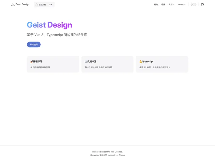
Geist Design
Vue3 Component library @whouu/geist-design
Overview:
The geist-design is a theme that provides a collection of components and features for easy and efficient web development. It offers a wide range of pre-built components such as buttons, icons, grids, forms, data displays, feedback options, navigation elements, and more. With its simple installation process and comprehensive documentation, geist-design makes it convenient for developers to quickly implement and customize various UI elements in their projects.
Features:
- Button: A customizable button component for easy user interactions.
- Code: A code display component for showcasing and highlighting code snippets.
- Icons: A collection of commonly used icons for visual enhancement.
- Spacer: A placeholder component for creating consistent spacing within layouts.
- Grid: A responsive grid system for easy and flexible layouts.
- Layout: A container component for managing the overall layout structure.
- Card: A versatile card component for organizing and displaying content.
- Fieldset: A form control group component for grouping related input fields.
- Collapse: An accordion-style component for collapsible content sections.
- Input: An input field component for capturing user input.
- Textarea: A multi-line text input component for capturing longer user input.
- Slider: A slider component for selecting a value within a specified range.
- Toggle: A switch component for toggling between two states.
- Checkbox: A checkbox component for selecting one or multiple options.
- Radio: A radio button component for selecting one option from multiple choices.
- Select: A dropdown select component for choosing options from a list.
- Avatar: A component for displaying user avatars or profile images.
- Badge: A visual indicator component for displaying status or notification.
- Description: A component for displaying additional information or details.
- Display: A component for showcasing and highlighting specific content.
- Dot: A visual dot component for indicator or status representation.
- Keyboard: A component for displaying keyboard inputs or shortcuts.
- Tag: A component for categorizing or labeling content with tags.
- User: A component for displaying user information or profile details.
- Image: An image component for displaying images or visual content.
- Popover: A component for displaying additional information or actions in a popover.
- Tooltip: A component for showing contextual information or tooltips.
- Table: A table component for displaying tabular data.
- Toast: A component for displaying temporary notifications or messages.
- Note: A component for displaying informational or reminder messages.
- Rate: A component for rating or ranking content.
- Spinner: A component for indicating a loading or processing state.
- Progress: A component for visualizing progress or completion status.
- More: A component for displaying additional options or actions.
- Dialog: A component for displaying modal dialogs or pop-ups.
- Link: A component for linking to external or internal resources.
- Tabs: A component for creating tabbed navigation or content sections.
- Snippet: A reusable code snippet fragment for easy code reusability.
Using pnpm:
pnpm add geist-design
Using npm:
npm install geist-design
Using yarn:
yarn add geist-design
To quickly get started, import the necessary components in your main.ts file:
import {
  Button,
  Code,
  Icons,
  Spacer,
  Grid,
  Layout,
  Card,
  Fieldset,
  Collapse,
  // Add more imported components here
} from 'geist-design';
For detailed documentation and usage examples, refer to the official geist-design documentation and npm package.
Summary:
The geist-design theme offers a comprehensive collection of pre-built components that facilitate easy and efficient web development. With its intuitive installation process and extensive documentation, developers can quickly incorporate various UI elements into their projects. Whether it's buttons, forms, data displays, feedback options, or navigation elements, geist-design provides a wide range of customizable components to enhance the user experience. It's a versatile theme that can be easily integrated into different web applications and websites.
- Vite
Vite is a build tool that aims to provide a faster and leaner development experience for modern web projects
- Vitepress
VitePress is a static site generator designed for creating documentation websites. It offers a lightweight and fast development experience using Vue.js and Markdown, with features such as live-reload, theming, and customizable layout components.
- Vue
Vue.js is a lightweight and flexible JavaScript framework that allows developers to easily build dynamic and reactive user interfaces. Its intuitive syntax, modular architecture, and focus on performance make it a popular choice for modern web development.
- SCSS
SCSS is a preprocessor scripting language that extends the capabilities of CSS by adding features such as variables, nesting, and mixins. It allows developers to write more efficient and maintainable CSS code, and helps to streamline the development process by reducing repetition and increasing reusability.
- Geist UI
Geist UI is a modern, minimalist React component library inspired by Vercel's design language. It provides clean, elegant components with a focus on simplicity and developer experience, perfect for building modern web applications.
- UI Kits & Components

A UI kit provides developers with a set of reusable components that can be easily integrated into a website or application. These components are pre-designed with consistent styling and functionality, allowing developers to save time and effort in the design and development process. UI kits can be either custom-built or third-party, and often include components for buttons, forms, typography, icons, and more.
- Eslint

ESLint is a linter for JavaScript that analyzes code to detect and report on potential problems and errors, as well as enforce consistent code style and best practices, helping developers to write cleaner, more maintainable code.
- Postcss

PostCSS is a popular open-source tool that enables web developers to transform CSS styles with JavaScript plugins. It allows for efficient processing of CSS styles, from applying vendor prefixes to improving browser compatibility, ultimately resulting in cleaner, faster, and more maintainable code.
- Prism JS

PrismJS is an open-source, lightweight, and extensible syntax highlighting library that supports a wide range of programming languages and markup formats.
- Typescript

TypeScript is a superset of JavaScript, providing optional static typing, classes, interfaces, and other features that help developers write more maintainable and scalable code. TypeScript's static typing system can catch errors at compile-time, making it easier to build and maintain large applications.