React Components
React components library.
## Overview
The Pansy React components offer a variety of tools for developers seeking to enhance their web applications. These components are designed to be user-friendly and efficient, providing solutions for various needs such as watermarking, media playback, and responsive design.
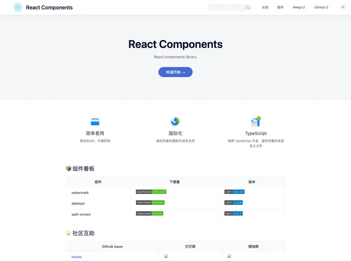
## Features
- **@pansy/react-watermark**: This component easily adds customizable watermarks to your content, enhancing branding while maintaining a clean design.
- **@pansy/react-aliplayer**: A robust media player that supports various video formats, offering a seamless experience for audio and video playback.
- **@pansy/react-split-screen**: Utilizes a split-screen feature that allows for dynamic layouts, perfect for applications that require multiple views at once.
- **@pansy/react-responsive-card**: This component allows developers to create responsive cards with ease, adapting to different screen sizes without compromising aesthetics.
- **Community Support**: Active community support available through platforms like GitHub, making it easy to troubleshoot and share insights with other developers.
- React
React is a widely used JavaScript library for building user interfaces and single-page applications. It follows a component-based architecture and uses a virtual DOM to efficiently update and render UI components
- Ant Design
Ant Design is a React UI library that provides a set of pre-designed components and design resources for building high-quality, responsive web applications.
- Typescript

TypeScript is a superset of JavaScript, providing optional static typing, classes, interfaces, and other features that help developers write more maintainable and scalable code. TypeScript's static typing system can catch errors at compile-time, making it easier to build and maintain large applications.