Keycloakify Shadcn Starter
Overview
The Keycloakify Shadcn Starter is an innovative solution for developers looking to elevate their Keycloak login experience with a modern look and feel. Built using React, TypeScript, and Tailwind CSS v4, this theme integrates seamlessly into any project while offering a flexible and customizable login flow. Whether you're aiming for a polished corporate appearance or a vibrant user interface, this starter pack provides the tools to create a visually stunning authentication system.
The inclusion of built-in features, such as dark mode, multi-language support, and comprehensive social login options, sets the Keycloakify Shadcn Starter apart. By streamlining the development process and enhancing user experience, it caters to both novice and experienced developers seeking a reliable authentication theme that adheres to contemporary design practices.
Features
- Modern UI: Beautiful and responsive design crafted with Tailwind CSS v4 and shadcn/ui components for an eye-catching user interface.
- Dark Mode: Offers built-in theme toggling options with persistent user preferences, ensuring comfort during day and night usage.
- Multi-language Support: Fully i18n ready with translations in English, French, and Arabic, including RTL support for diverse global audiences.
- Custom Email Templates: Creates styled email notifications for all Keycloak events using jsx-email, enhancing communication with users.
- Complete Login Flow: Customized versions of all 35+ Keycloak login pages ensure a consistent branding experience from start to finish.
- Social Login Providers: Pre-styled icons for over 16 OAuth providers (like Google, GitHub, Microsoft) simplify the login process for users.
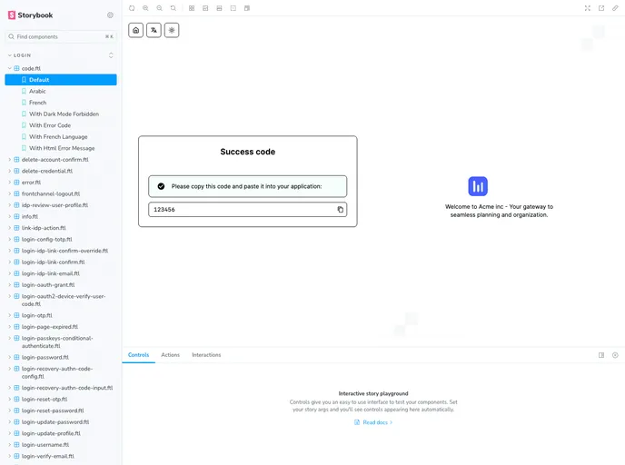
- Storybook Integration: Visual testing and comprehensive documentation allow developers to see and understand all components clearly.
- Type-Safe: Leverages TypeScript support across the entire codebase, promoting better development practices and reducing potential errors.
- React
React is a widely used JavaScript library for building user interfaces and single-page applications. It follows a component-based architecture and uses a virtual DOM to efficiently update and render UI components
- Vite
Vite is a build tool that aims to provide a faster and leaner development experience for modern web projects
- Tailwind
Tailwind CSS is a utility-first CSS framework that provides pre-defined classes for building responsive and customizable user interfaces.
- cmdk
cmdk is a fast, composable command menu component for React. It provides the foundation for building command palettes, search interfaces, and keyboard-navigable menus similar to those found in applications like VS Code, Linear, and Raycast.
- Shadcn UI
Beautifully designed components that you can copy and paste into your apps. Accessible. Customizable. Open Source.
- Eslint

ESLint is a linter for JavaScript that analyzes code to detect and report on potential problems and errors, as well as enforce consistent code style and best practices, helping developers to write cleaner, more maintainable code.
- Storybook
Storybook is a tool for developing and testing UI components in isolation. It provides a sandbox environment where you can experiment with different props and states to see how your component responds.
- Typescript

TypeScript is a superset of JavaScript, providing optional static typing, classes, interfaces, and other features that help developers write more maintainable and scalable code. TypeScript's static typing system can catch errors at compile-time, making it easier to build and maintain large applications.