Bootstrap Responsive Tabs
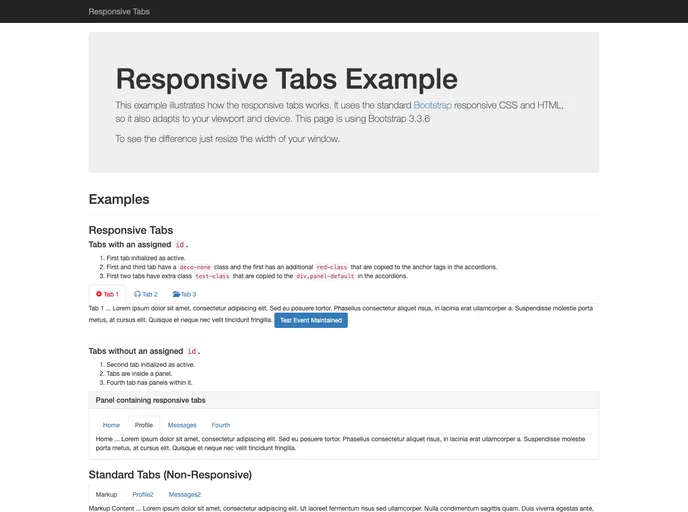
Bootstrap responsive tabs are tabs that switch to collapsible components (accordions) when resized.
Overview
Bootstrap Responsive Tabs is an innovative solution for creating dynamic tabbed content on your website. Leveraging the power of Bootstrap 3.0.0, this feature allows you to design an engaging user experience that adapts beautifully across different screen sizes. Whether on desktop or mobile, these responsive tabs seamlessly transform into an accordion layout for a more manageable presentation.
What sets Bootstrap Responsive Tabs apart is the simplicity of customization. With just a minor tweak in the javascript settings, you can dictate how the tabs behave on various devices, ensuring that your content remains accessible and visually appealing. This flexibility makes it an ideal choice for developers looking to enhance the interactivity of their web applications.
Features
- Standard Bootstrap Markup: Utilizes familiar Bootstrap tab markup for easy integration into existing projects.
- Collapsible Components: Built with jQuery, enabling an accordion-style display for enhanced usability on smaller screens.
- Keyboard Accessibility: Designed to be accessible, allowing users to navigate through tabs and accordions using keyboard shortcuts.
- Multiple Tab Groups: Supports including various tab groups on a single page, providing organized content management.
- Responsive Design: Automatically adjusts from traditional tabs to collapsible elements based on screen size, ensuring a user-friendly experience.
- Customizable Behavior: User-friendly configuration allows you to modify how tabs and accordions function through a simple javascript attribute.