Password Input
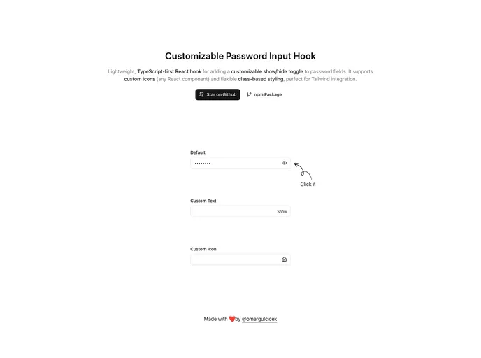
Lightweight, TypeScript-first React hook for adding a customizable show/hide toggle to password fields. It supports custom icons (any React component) and flexible class-based styling, perfect for Tailwind integration.
Overview
The lightweight password input solution by Omer Gulcicek is designed to enhance user experience in forms with a customizable password visibility toggle. Built with TypeScript in mind and leveraging React hooks, this component allows developers to efficiently integrate a show/hide feature into password fields, making it both secure and user-friendly. With support for custom icons and flexible styling options, this tool is a great fit for modern web applications, especially those using the Tailwind CSS framework.
Features
- Password Toggle: Easily enable show/hide password functionality to enhance security and usability.
- Custom Icons: Utilize any React component as icons for the toggle button, allowing full visual customization.
- TypeScript Support: Provides complete type safety, ensuring a smoother development experience with fewer errors.
- Customizable Styling: Offers options for custom class names and styles, making it adaptable to various design systems.
- Accessible: Incorporates proper ARIA labels and keyboard support to ensure accessibility for all users.
- Flexible Integration: Works seamlessly with any CSS framework or custom styles, providing versatility in various project types.
- Lightweight: Minimal impact on bundle size, keeping your application fast and efficient.
- Zero Configuration: Designed to work out of the box with sensible defaults, simplifying implementation for developers.
- React
React is a widely used JavaScript library for building user interfaces and single-page applications. It follows a component-based architecture and uses a virtual DOM to efficiently update and render UI components
- Tailwind
Tailwind CSS is a utility-first CSS framework that provides pre-defined classes for building responsive and customizable user interfaces.
- UI Kits & Components

A UI kit provides developers with a set of reusable components that can be easily integrated into a website or application. These components are pre-designed with consistent styling and functionality, allowing developers to save time and effort in the design and development process. UI kits can be either custom-built or third-party, and often include components for buttons, forms, typography, icons, and more.
- Typescript

TypeScript is a superset of JavaScript, providing optional static typing, classes, interfaces, and other features that help developers write more maintainable and scalable code. TypeScript's static typing system can catch errors at compile-time, making it easier to build and maintain large applications.