Joy Theme Creator
Exposes theming options available in Joy UI by providing color palette and typography controls.
Overview
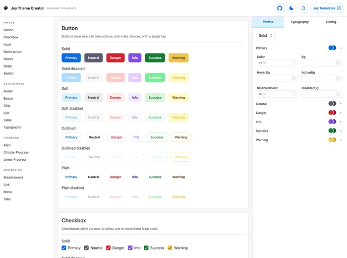
The Joy Theme Creator is a project that allows users to customize and create themes for Joy UI. While it is still in alpha, it provides access to color palette and typography controls. It also enables users to easily copy the theme configuration object into their own Joy UI project's source code.
Features
- Theming Options: The Joy Theme Creator exposes the theming options available in Joy UI, including color palette and typography controls.
- Customization: Users can tinker with the controls provided by the project to create their desired theme.
- Easy Integration: The theme configuration object can be easily copied into a user's Joy UI project after customization.
Summary
The Joy Theme Creator is a helpful tool for developers using Joy UI who want to create custom themes. It provides theming options such as color palette and typography controls, and allows users to easily integrate the customized theme into their own Joy UI projects. Although it is still in alpha, it offers a quick and efficient way to create and apply themes in Joy UI.
- React
React is a widely used JavaScript library for building user interfaces and single-page applications. It follows a component-based architecture and uses a virtual DOM to efficiently update and render UI components
- Material UI
material-ui adds classes to Tailwind CSS for all common UI components. Classes like btn, card, etc. This allows us to focus on important things instead of making basic elements for every project.
- Templates & Themes

A template or theme refers to a pre-designed layout or structure that provides a basic framework for building a specific type of application or website. It typically includes good design, placeholder content and functional features, allowing developers to customize and fill in the details according to their specific needs.
- UI Kits & Components

A UI kit provides developers with a set of reusable components that can be easily integrated into a website or application. These components are pre-designed with consistent styling and functionality, allowing developers to save time and effort in the design and development process. UI kits can be either custom-built or third-party, and often include components for buttons, forms, typography, icons, and more.
- Typescript

TypeScript is a superset of JavaScript, providing optional static typing, classes, interfaces, and other features that help developers write more maintainable and scalable code. TypeScript's static typing system can catch errors at compile-time, making it easier to build and maintain large applications.