Np UI Lib
Native Angular UI Components and Design Framework
Overview
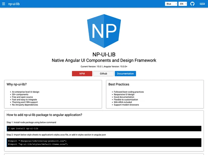
Native Angular UI Components and Design Framework offers a comprehensive suite of tools to enhance the development of Angular applications. With a focus on both functionality and aesthetics, this framework simplifies the process of building intuitive user interfaces with a broad range of customizable components.
The framework provides everything from basic input forms to advanced components like data grids and modals, making it a versatile choice for developers looking to streamline their workflow. Its clear documentation and ease of integration with existing Angular applications ensure a seamless experience for both new and seasoned developers.
Features
-
Diverse Component List: Includes essential UI elements such as Input Text, Dropdowns, and a rich set of controls like Date Picker and Time Picker to cover various user interaction needs.
-
Dynamic Content Handling: Equipped with components like Data Grid and Paginator, it allows for dynamic content display and efficient user navigation.
-
Customizable Styling Options: Easy integration of themes and framework CSS lets developers personalize the look and feel of their applications effortlessly.
-
Accessibility Features: Implements i18N support, ensuring that applications can reach a wider audience by accommodating multiple languages.
-
User Engagement Tools: Features like Notifications, Alerts, and Tooltips enhance user interaction by providing relevant information in real-time.
-
Advanced Layout Control: Provides grid layout options and tools for handling padding and margin, allowing for precise UI arrangement.
-
Modals and Dialogs: Prebuilt components for dialogs and modals simplify the process of creating pop-up interfaces, enhancing the overall user experience.
-
Robust Documentation: Comprehensive guides and release notes ensure developers can efficiently utilize all available features and troubleshoot any issues that may arise.
- Angular
Angular is a TypeScript-based open-source framework by Google for building dynamic single-page applications and cross-platform mobile apps with MVC architecture and a rich set of features.
- UI Kits & Components

A UI kit provides developers with a set of reusable components that can be easily integrated into a website or application. These components are pre-designed with consistent styling and functionality, allowing developers to save time and effort in the design and development process. UI kits can be either custom-built or third-party, and often include components for buttons, forms, typography, icons, and more.
- Typescript

TypeScript is a superset of JavaScript, providing optional static typing, classes, interfaces, and other features that help developers write more maintainable and scalable code. TypeScript's static typing system can catch errors at compile-time, making it easier to build and maintain large applications.