Ng Multiselect Dropdown
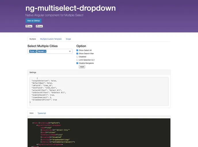
Multiple Select Dropdown Component
Overview
The Angular Multiselect Dropdown is a versatile and user-friendly component designed for web applications. It offers an intuitive interface that allows developers to easily integrate and customize dropdowns to meet their application's needs. With its ability to bind to any custom data source, this dropdown component is an excellent choice for those looking to enhance the interactive experience of their web applications.
What sets this component apart is its flexibility. Whether you need single or multiple selection options, the Angular Multiselect Dropdown adapts to your requirements and provides features like search functionality, custom themes, and more, making it a robust addition to any project.
Features
-
Single/Multiple Selection Option: Customize the selection mode to allow users to pick one or multiple items based on your app's requirements.
-
Custom Data Binding: Seamlessly bind the dropdown to any custom data sources, offering flexibility to utilize various data formats.
-
Search Functionality: Enhance user experience with a search option, enabling users to find items quickly using a customizable placeholder text.
-
Limit Selection: Control the number of items users can select, which helps manage user input effectively.
-
Select/Deselect All Items: Provide convenience with a feature that allows users to quickly select or deselect all options in the dropdown.
-
Custom Themes: Tailor the appearance of the dropdown to match your application's design with customizable themes.
- Angular
Angular is a TypeScript-based open-source framework by Google for building dynamic single-page applications and cross-platform mobile apps with MVC architecture and a rich set of features.
- Typescript

TypeScript is a superset of JavaScript, providing optional static typing, classes, interfaces, and other features that help developers write more maintainable and scalable code. TypeScript's static typing system can catch errors at compile-time, making it easier to build and maintain large applications.