Tailwind Blog
Blog Template built with TailwindCSS features accessible, mobile-responsive components
Overview
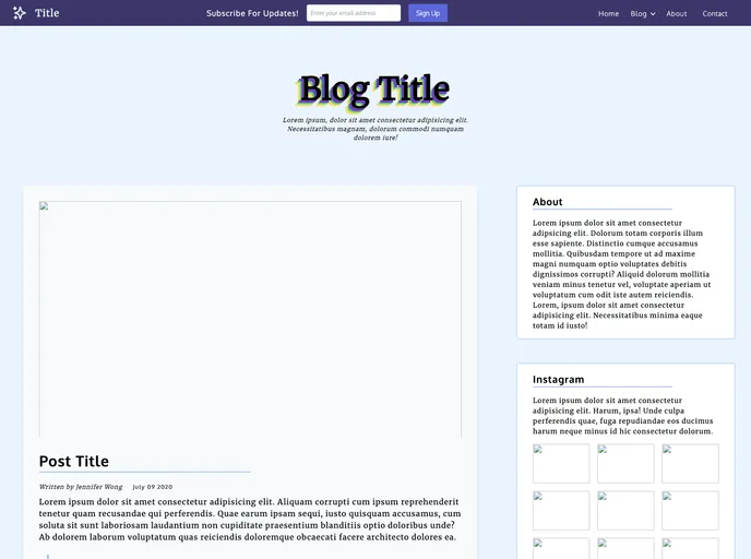
The TailwindCSS template I recently came across offers a sleek, mobile-responsive design that’s perfect for anyone looking to create an engaging online presence. With an emphasis on aesthetics and usability, this template is well-suited for bloggers and businesses alike. Its modern layout and user-friendly features make it easy to highlight content while also navigating the site effortlessly.
Features
- Mobile Responsive Design: Automatically adjusts to various screen sizes, ensuring a smooth user experience on mobile devices and tablets.
- Featured Post with Sidebar: Showcases top content prominently while providing additional information in the sidebar, including an About section and an Instagram feed.
- Card Grid Layout for Recent Posts: Displays recent blog posts in a visually appealing card format, making them easy to scan and access.
- Axe Beta Compliance: Passes accessibility tests, ensuring that the design is usable by individuals with disabilities, promoting inclusivity.
- Lighthouse Performance: Achieves high performance ratings, optimizing load times and enhancing user engagement.
- Tailwind
Tailwind CSS is a utility-first CSS framework that provides pre-defined classes for building responsive and customizable user interfaces.
- Blog

Blog websites feature posts written by one or more authors, organized by categories and tags, with a section for comments and archives sorted by date or topic. Additional features may include search bar, social media sharing, subscription or RSS feed, about and contact pages, and visual content.
- Templates & Themes

A template or theme refers to a pre-designed layout or structure that provides a basic framework for building a specific type of application or website. It typically includes good design, placeholder content and functional features, allowing developers to customize and fill in the details according to their specific needs.
- GitHub Pages

Gridsome is a Vue.js-based static site generator that makes it easy to build fast and flexible websites and applications by leveraging modern web technologies like GraphQL, Webpack, and hot reloading