StreamlitAntdComponentsDemo
Streamlit-antd-components demo app
Overview
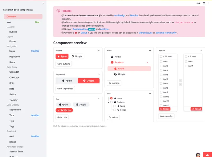
The demo app built with Streamlit and Ant Design components showcases a seamless integration of various user interface elements. This application not only serves as a guide for developers looking to incorporate these components into their projects, but it also highlights the ease of use and flexibility that Streamlit offers. With vivid examples and intuitive design, users can quickly grasp the potential of each component.
The project is ideal for both novice and experienced developers who wish to explore the capabilities of Ant Design in a Streamlit environment. By providing a hands-on approach to learning, the demo app elevates the user experience and simplifies the integration process.
Features
-
Comprehensive Component Showcase: Displays a variety of components, detailing each one's functionality with user-friendly examples.
-
Interactive Design: Users can engage with components directly, allowing for practical learning and experimentation.
-
User-Friendly Interface: Intuitive navigation makes it easy to find and understand each component's usage and styling options.
-
Responsive Layout: The app adapts smoothly to different screen sizes, ensuring accessibility across devices.
-
Detailed Documentation: Offers insights into each component's APIs and properties, making implementation straightforward for developers.
-
Real-Time Updates: Changes made to components can be viewed instantly, aiding in effective debugging and faster development cycles.
- Mantine UI
A fully featured React components library. 100+ components, 50+ hooks.