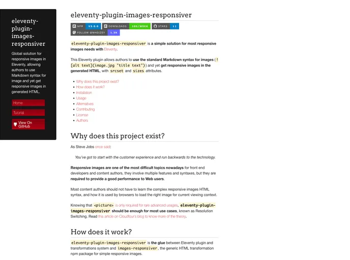
Eleventy Plugin Images Responsiver
Global solution for responsive images in Eleventy, allowing authors to use Markdown syntax for image and yet get responsive images in generated HTML.
Overview
The eleventy-plugin-images-responsiver is an ingenious solution tailored for those who wish to implement responsive images in their Eleventy projects, all while using the familiar Markdown syntax. This plugin bridges the gap between the simplicity of Markdown and the complex requirements of responsive images, enabling content authors to enhance their web performance without diving deep into technical intricacies. By automatically generating srcset and sizes attributes in the rendered HTML, it eases the burdens typically associated with responsive design.
This plugin is designed with a focus on user experience, promoting a seamless integration that requires minimal knowledge of the underlying HTML code. It's a perfect tool for both seasoned developers and newcomers looking for an efficient way to enhance their images while maintaining a well-functioning website.
Features
- Markdown Compatibility: Utilize standard Markdown syntax for images, ensuring ease of use while generating responsive HTML.
- Automatic Attribute Generation: The plugin automatically adds
srcsetandsizesattributes to images, optimizing performance for various display contexts. - Ease of Installation: Simple to install as a dev dependency in your Eleventy project, making it accessible for quick integration.
- User-Friendly Transformation: Acts as the intermediary between Eleventy's plugin system and the images-responsiver package, simplifying image transformations.
- No Image Generation Needed: Works with existing images or in conjunction with local resizing solutions and third-party services like Cloudinary.
- Comprehensive Documentation: Offers a step-by-step tutorial for users to easily navigate through setup, with practical examples to enhance understanding.
- Versatile Alternatives: Provides insight into other responsive image plugins for users looking for different functionalities or approaches.
- Eleventy
11ty is a static site generator that allows developers to build fast, modern websites using HTML, Markdown, and other templating languages, without the need for a complex build system.
- Blog

Blog websites feature posts written by one or more authors, organized by categories and tags, with a section for comments and archives sorted by date or topic. Additional features may include search bar, social media sharing, subscription or RSS feed, about and contact pages, and visual content.
- Eslint

ESLint is a linter for JavaScript that analyzes code to detect and report on potential problems and errors, as well as enforce consistent code style and best practices, helping developers to write cleaner, more maintainable code.