Neeto UI
A component library from BigBinary.
Overview
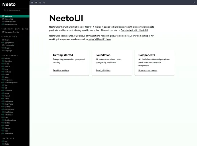
NeetoUI is a component library developed by BigBinary that enhances the user experience across all neeto products. The library has evolved significantly, especially with the release of version 3.0.x, where the stylesheet was separated from the main bundle, making it more flexible and easier to manage. This separation allows developers to efficiently utilize the styles in their applications, simplifying the installation and integration process while ensuring a cohesive design language.
What stands out about NeetoUI is its integration with tools like Formik and React Toastify, enhancing form handling and notifications within applications. It allows developers to create dynamic components easily, making integration simple and straightforward.
Features
- Easy Installation: Integrate NeetoUI by installing the package into your application, with clear instructions for importing stylesheets directly into your main SCSS entry point.
- React Toastify Integration: NeetoUI seamlessly works with React Toastify, allowing for the easy incorporation of toast notifications into your applications for better user feedback.
- Formik Support: NeetoUI provides built-in support for Formik, simplifying form handling and making it much easier to manage form states and validations.
- Named Exports: All components in NeetoUI are exported as named exports, enabling selective imports and reducing unnecessary code in your application.
- Dynamic Component Rendering: Use wildcard imports to access a reference object containing all components, facilitating the rendering of components dynamically as needed.
- Customizable Form Component: The Form component in NeetoUI accepts various props for more flexibility, including className for custom styling and formProps for additional configurations.
- Storybook Integration: NeetoUI supports Storybook for component development, allowing developers to visually test and refine their components easily.
- Comprehensive Testing: The library includes testing setups to help catch warnings and errors in console logs, ensuring robust applications.
- Express
Express.js is a simple Node.js framework for single, multi-page, and hybrid web applications.
- React
React is a widely used JavaScript library for building user interfaces and single-page applications. It follows a component-based architecture and uses a virtual DOM to efficiently update and render UI components
- SCSS
SCSS is a preprocessor scripting language that extends the capabilities of CSS by adding features such as variables, nesting, and mixins. It allows developers to write more efficient and maintainable CSS code, and helps to streamline the development process by reducing repetition and increasing reusability.
- Tailwind
Tailwind CSS is a utility-first CSS framework that provides pre-defined classes for building responsive and customizable user interfaces.
- Ant Design
Ant Design is a React UI library that provides a set of pre-designed components and design resources for building high-quality, responsive web applications.
- UI Kits & Components

A UI kit provides developers with a set of reusable components that can be easily integrated into a website or application. These components are pre-designed with consistent styling and functionality, allowing developers to save time and effort in the design and development process. UI kits can be either custom-built or third-party, and often include components for buttons, forms, typography, icons, and more.
- Dark Mode
Dark mode is a user interface option that uses a dark color scheme instead of light. It reduces eye strain and improves visibility in low-light conditions. Implementing dark mode in a website or application involves updating the styles and color palette to support both light and dark modes.
- Eslint

ESLint is a linter for JavaScript that analyzes code to detect and report on potential problems and errors, as well as enforce consistent code style and best practices, helping developers to write cleaner, more maintainable code.
- Formik

Formik is a popular form library for React that helps with form state management, validation, and submission handling. It provides a declarative approach to building forms with support for complex validation scenarios and easy integration with validation libraries like Yup.
- Framer Motion

Alpine.js is a lightweight JavaScript framework that simplifies the process of creating dynamic, reactive user interfaces on the web. It uses a declarative syntax that offers a higher level of abstraction compared to vanilla JavaScript, while being more performant and easier to use than jQuery.
- Postcss

PostCSS is a popular open-source tool that enables web developers to transform CSS styles with JavaScript plugins. It allows for efficient processing of CSS styles, from applying vendor prefixes to improving browser compatibility, ultimately resulting in cleaner, faster, and more maintainable code.
- Rollup

RollupJS is a popular and efficient JavaScript module bundler that takes the code from multiple modules and packages them into a single optimized file, minimizing the overall size of the application and improving its performance.
- Storybook
Storybook is a tool for developing and testing UI components in isolation. It provides a sandbox environment where you can experiment with different props and states to see how your component responds.
- Yup
Yup is a schema builder for runtime value parsing and validation. It provides a declarative way to define validation schemas with support for complex nested objects, array validation, and custom validation rules. Often used with Formik for form validation.
- Zustand
Zustand is a lightweight state management library for React that provides a simple and intuitive API for managing state in your application. It allows developers to easily create and manage global state, and provides a powerful set of tools for optimizing performance and improving developer productivity. Zustand is designed to be easy to use and easy to learn, making it a popular choice for developers of all skill levels.