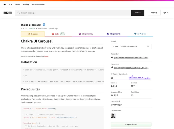
Chakra UI Carousel
Overview
The Chakra UI Carousel is an elegant and flexible carousel library designed for use with Chakra UI, providing a seamless way to showcase content in a visually appealing manner. Its capability to utilize Chakra's props offers developers a significant level of customization, making it easier to fit the carousel into diverse application layouts and designs. With a user-friendly interface and a simple setup process, incorporating the Carousel into your project can enhance the overall user experience.
This library allows for the integration of various functional components like buttons, ensuring users have full control over the carousel's navigation while maintaining a cohesive design aesthetic. Whether you're showcasing images, testimonials, or any other horizontal content, the Chakra UI Carousel serves as a solid choice for both performance and versatility.
Features
- Customizability: You can pass all Chakra UI props to the Carousel buttons, allowing for extensive customization of styles and behavior.
- Easy Integration: Requires a simple setup with the ChakraProvider, making it easy to incorporate into existing projects.
- Flexible Button Placement: Control buttons for navigating the carousel can be placed anywhere around the carousel, providing flexibility in design.
- Gap Control: Specify the gap between slides via a prop, ensuring the layout fits perfectly with your design.
- Custom Button Components: The ability to pass custom components for navigation buttons enhances the functionality and design of the carousel.
- Support for Community Contributions: Users are encouraged to propose features or report issues, fostering a collaborative environment for improvement.
- React
React is a widely used JavaScript library for building user interfaces and single-page applications. It follows a component-based architecture and uses a virtual DOM to efficiently update and render UI components
- Chakra UI
Chakra UI is a popular open-source React component library that provides a set of accessible and customizable UI components to help developers create modern web applications.
- Eslint

ESLint is a linter for JavaScript that analyzes code to detect and report on potential problems and errors, as well as enforce consistent code style and best practices, helping developers to write cleaner, more maintainable code.
- Formik

Formik is a popular form library for React that helps with form state management, validation, and submission handling. It provides a declarative approach to building forms with support for complex validation scenarios and easy integration with validation libraries like Yup.
- Framer Motion

Alpine.js is a lightweight JavaScript framework that simplifies the process of creating dynamic, reactive user interfaces on the web. It uses a declarative syntax that offers a higher level of abstraction compared to vanilla JavaScript, while being more performant and easier to use than jQuery.
- Typescript

TypeScript is a superset of JavaScript, providing optional static typing, classes, interfaces, and other features that help developers write more maintainable and scalable code. TypeScript's static typing system can catch errors at compile-time, making it easier to build and maintain large applications.
- Yup
Yup is a schema builder for runtime value parsing and validation. It provides a declarative way to define validation schemas with support for complex nested objects, array validation, and custom validation rules. Often used with Formik for form validation.