Stateful Button React
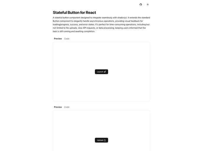
A custom stateful button component designed to integrate seamlessly with shadcn/ui, providing visual feedback for loading/progress, success, and error states during asynchronous operations.
Overview
The Stateful Button for shadcn/ui is a game changer when it comes to managing asynchronous actions in a user-friendly way. Designed with accessibility and responsiveness in mind, it offers a clear visual representation of various states that a button can encounter during operations. Whether you are dealing with slow API requests or complex data processing, this button helps keep users informed, making the interaction smoother and more enjoyable.
By integrating the Stateful Button into your project, you not only enhance user experience but also ensure that accessibility standards are met with ARIA support and screen reader compatibility. Its use cases are broad, catering to any scenario where feedback is essential—truly a must-have for developers focused on delivering high-quality applications.
Features
- Multiple States: The button transitions through clearly defined states—idle, loading, success, and error—providing immediate visual feedback tailored to the user's action.
- Async-Friendly: Designed to work efficiently with Promise-based handlers, it ensures seamless performance during any asynchronous operations.
- Powered by XState: Utilizes a state machine approach for predictable and robust state transitions, reducing the chance of unexpected behavior.
- Accessibility By Default: Comes equipped with ARIA messages and comprehensive screen reader support, promoting inclusivity in every application.
- Fully Customizable: Shipped as source code via shadcn/ui CLI, allowing for extensive customization to suit your project’s unique design needs.
- Spinner and Progress Modes: Offers two modes of user feedback—spinner mode for active loading and progress mode for displaying the percentage of task completion.
- Extended Props: Builds on standard HTML attributes and button variants while also including custom props for enhanced functionality during interactions.
- Next.js
Next.js is a React-based web framework that enables server-side rendering, static site generation, and other powerful features for building modern web applications.
- React
React is a widely used JavaScript library for building user interfaces and single-page applications. It follows a component-based architecture and uses a virtual DOM to efficiently update and render UI components
- Tailwind
Tailwind CSS is a utility-first CSS framework that provides pre-defined classes for building responsive and customizable user interfaces.
- Radix UI
Radix Primitives is a low-level UI component library with a focus on accessibility, customization and developer experience. You can use these components either as the base layer of your design system, or adopt them incrementally.
- Shadcn UI
Beautifully designed components that you can copy and paste into your apps. Accessible. Customizable. Open Source.
- Eslint

ESLint is a linter for JavaScript that analyzes code to detect and report on potential problems and errors, as well as enforce consistent code style and best practices, helping developers to write cleaner, more maintainable code.
- Motion

Motion (formerly Framer Motion) is a production-ready animation library for React and JavaScript. It provides a simple declarative API for creating fluid animations, gestures, and transitions with excellent performance and accessibility.
- Typescript

TypeScript is a superset of JavaScript, providing optional static typing, classes, interfaces, and other features that help developers write more maintainable and scalable code. TypeScript's static typing system can catch errors at compile-time, making it easier to build and maintain large applications.