React Tree
Hierarchical tree component for React in Typescript
Overview
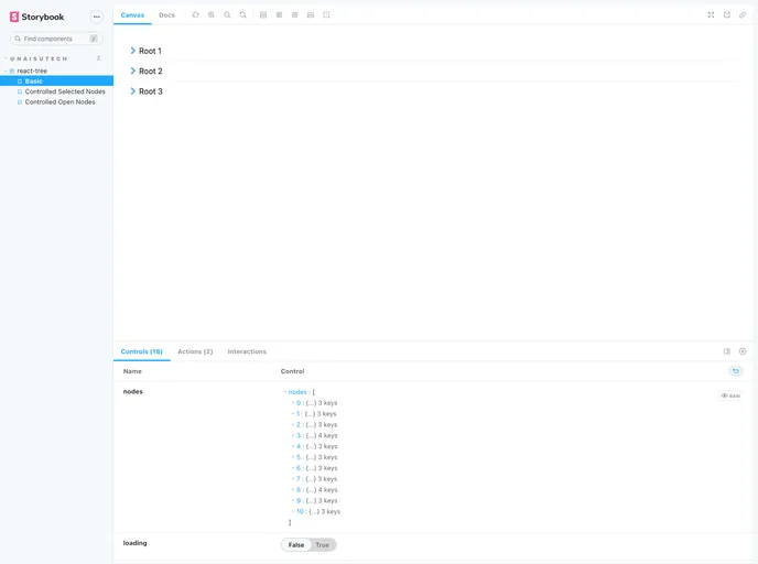
The react-tree component is an innovative and versatile tool designed for React applications using TypeScript. It enables developers to create hierarchical tree structures effortlessly, providing a robust and user-friendly interface. With its extensive features including theming support and customizable properties, react-tree is ideal for applications that require a flexible and interactive way of presenting data in a tree format.
This component not only optimizes user experience with clear indicators for expanded and selected nodes but also integrates seamlessly into different layouts. Whether you are building a complex application or a simple data viewer, this tree component can adapt to various needs, making it a great addition to any developer's toolkit.
Features
- Written in TypeScript: Ensures full typings exported from the package, enhancing developer experience through better type safety.
- Theming Support: Offers customization for almost all aspects of the component's appearance and includes new partial theming options.
- Uncontrolled and Controlled Modes: Use it as an uncontrolled component with default props or fully controlled with event listeners for selected and open nodes.
- Flexibility in Layouts: Fully stylable container that works with fixed widths, flex-box layouts, or scrollable containers for long lists.
- User Experience Optimizations: Clearly indicates open/closed folders and selected items, providing feedback on user interactions.
- Customizable Messages: Alter component messages such as no data or loading states through the messages prop to better suit your application.
- Multi-Select API: Allows selection and deselection of multiple nodes using the OS's meta key or ctrl key, enhancing usability.
- Context-Based State Management: The new v3 version improves maintainability and business logic handling through an efficient context-based approach.
- React
React is a widely used JavaScript library for building user interfaces and single-page applications. It follows a component-based architecture and uses a virtual DOM to efficiently update and render UI components
- Styled Components
Styled Components is a popular library for styling React components using CSS syntax. It allows you to write CSS in your JavaScript code, making it easier to create dynamic styles that are specific to each component.
- Eslint

ESLint is a linter for JavaScript that analyzes code to detect and report on potential problems and errors, as well as enforce consistent code style and best practices, helping developers to write cleaner, more maintainable code.
- Framer Motion

Alpine.js is a lightweight JavaScript framework that simplifies the process of creating dynamic, reactive user interfaces on the web. It uses a declarative syntax that offers a higher level of abstraction compared to vanilla JavaScript, while being more performant and easier to use than jQuery.
- Rollup

RollupJS is a popular and efficient JavaScript module bundler that takes the code from multiple modules and packages them into a single optimized file, minimizing the overall size of the application and improving its performance.
- Typescript

TypeScript is a superset of JavaScript, providing optional static typing, classes, interfaces, and other features that help developers write more maintainable and scalable code. TypeScript's static typing system can catch errors at compile-time, making it easier to build and maintain large applications.