Naco Svelte
Svelte component library for creating interfaces that feel native on web technologies.
Overview:
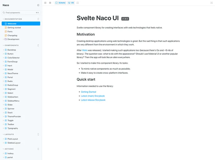
Svelte Naco UI is a version of the Svelte component library that allows developers to create web interfaces with a native feel. It was created to address the difference between web applications and their native counterparts. The library aims to mimic native components and make it easy to create cross-platform interfaces.
Features:
- Native-Like Components: Svelte Naco UI provides a set of components that mimic the appearance and behavior of native components.
- Cross-Platform Compatibility: The library is designed to enable developers to create interfaces that work seamlessly across different platforms.
- Lightweight and Efficient: Svelte Naco UI is built with optimization in mind, ensuring that the library is lightweight and performs well.
Summary:
Svelte Naco UI is a component library for Svelte that aims to replicate the look and feel of native components. It provides a collection of lightweight and efficient components that can be easily used to create cross-platform interfaces. By using Svelte Naco UI, developers can build web applications that closely resemble their native counterparts.
- React
React is a widely used JavaScript library for building user interfaces and single-page applications. It follows a component-based architecture and uses a virtual DOM to efficiently update and render UI components
- Svelte
Svelte is a modern front-end framework that compiles your code at build time, resulting in smaller and faster applications. It uses a reactive approach to update the DOM, allowing for high performance and a smoother user experience.
- Vite
Vite is a build tool that aims to provide a faster and leaner development experience for modern web projects
- SCSS
SCSS is a preprocessor scripting language that extends the capabilities of CSS by adding features such as variables, nesting, and mixins. It allows developers to write more efficient and maintainable CSS code, and helps to streamline the development process by reducing repetition and increasing reusability.
- UI Kits & Components

A UI kit provides developers with a set of reusable components that can be easily integrated into a website or application. These components are pre-designed with consistent styling and functionality, allowing developers to save time and effort in the design and development process. UI kits can be either custom-built or third-party, and often include components for buttons, forms, typography, icons, and more.
- Eslint

ESLint is a linter for JavaScript that analyzes code to detect and report on potential problems and errors, as well as enforce consistent code style and best practices, helping developers to write cleaner, more maintainable code.
- Postcss

PostCSS is a popular open-source tool that enables web developers to transform CSS styles with JavaScript plugins. It allows for efficient processing of CSS styles, from applying vendor prefixes to improving browser compatibility, ultimately resulting in cleaner, faster, and more maintainable code.
- Storybook
Storybook is a tool for developing and testing UI components in isolation. It provides a sandbox environment where you can experiment with different props and states to see how your component responds.
- Stylelint
Stylelint is a modern linter for CSS that helps you avoid errors and enforce consistent styling conventions. It provides rules for detecting errors and warnings, and can be configured to match your specific project's requirements.
- Typescript

TypeScript is a superset of JavaScript, providing optional static typing, classes, interfaces, and other features that help developers write more maintainable and scalable code. TypeScript's static typing system can catch errors at compile-time, making it easier to build and maintain large applications.