Lazydev
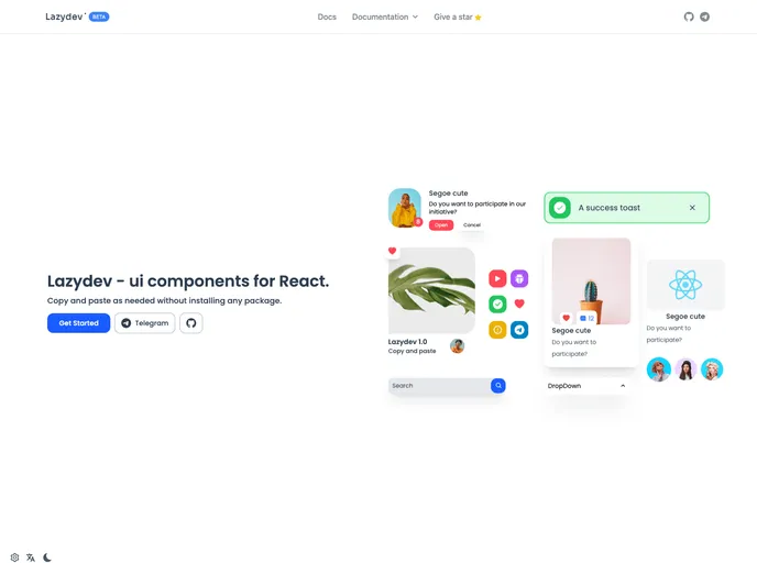
Lazydev - ui components for React.
Overview
Lezydev v1.x offers a solid suite of UI components that are designed to enhance the development experience for building modern applications. It provides a selection of essential components that are both versatile and easy to integrate, making it an appealing choice for developers looking to streamline their workflow.
Whether you're creating a simple website or a more complex application, Lezydev’s components can significantly improve the user interface. From buttons to alerts, each component is designed with flexibility in mind, enabling developers to utilize them in various contexts.
Features
- Alert: Easily display notifications and alerts to users with customizable messages and designs.
- Avatar: Display user images or icons to personalize interfaces and enhance user interaction.
- Button: Versatile buttons that can be styled and adapted for various actions within your application.
- Card: Organize and present content in a visually appealing manner, ideal for showcasing listings or information.
- Dialogs: Create modal windows for user confirmation or notifications, ensuring important messages are highlighted without leaving the page.
- Dropdown: Implement multi-option selections in a compact manner, making it efficient for users to choose from available options.
- Loading: Show loading indicators to enhance user experience during data fetches or processing times.
- Tooltip: Provide additional context or information when users hover over key elements, aiding in usability and accessibility.
- Next.js
Next.js is a React-based web framework that enables server-side rendering, static site generation, and other powerful features for building modern web applications.
- React
React is a widely used JavaScript library for building user interfaces and single-page applications. It follows a component-based architecture and uses a virtual DOM to efficiently update and render UI components
- Styled Components
Styled Components is a popular library for styling React components using CSS syntax. It allows you to write CSS in your JavaScript code, making it easier to create dynamic styles that are specific to each component.
- Tailwind
Tailwind CSS is a utility-first CSS framework that provides pre-defined classes for building responsive and customizable user interfaces.
- Eslint

ESLint is a linter for JavaScript that analyzes code to detect and report on potential problems and errors, as well as enforce consistent code style and best practices, helping developers to write cleaner, more maintainable code.
- MDX

MDX is a format that allows developers to write JSX within Markdown documents, combining the power of React with the simplicity of Markdown. This allows for the creation of dynamic and interactive content that can be easily shared and consumed across different platforms and devices.
- Postcss

PostCSS is a popular open-source tool that enables web developers to transform CSS styles with JavaScript plugins. It allows for efficient processing of CSS styles, from applying vendor prefixes to improving browser compatibility, ultimately resulting in cleaner, faster, and more maintainable code.