Components
Shareable React components
Overview
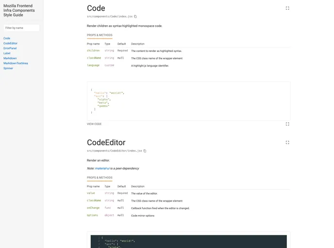
If you're diving into React development, discovering a robust component library like @material-ui/core can significantly enhance your project. This library not only simplifies the process of building stylish and responsive user interfaces but also provides a comprehensive style guide for easy navigation through components. With its development server, you can quickly preview your components and make necessary adjustments on the fly.
The project's commitment to using semantic-release ensures that every update is well-documented and aligned with the latest practices in version control. Whether you're a beginner or an experienced developer, this library presents a streamlined setup process that lets you focus on crafting your application rather than getting bogged down by configuration hassles.
Features
- Easy Installation: Quickly set up your project with necessary dependencies using yarn, making it accessible for both new and seasoned developers.
- Preview Server: Launch a development server that allows you to visually interact with your components in real-time, ensuring your UI is polished before going live.
- Automatic Releases: Utilize semantic-release to automate versioning and changelog generation based on your commit history, saving time and reducing manual errors.
- Responsive Design: Built on Material-UI, your components are styled using best practices, ensuring they look great on any device.
- Community Contributions: The project welcomes feedback and contributions, reflecting a vibrant community eager to improve the documentation and the library itself.
- Testing Infrastructure: Powered by BrowserStack, this library provides the tools necessary to ensure browser compatibility and quality assurance across multiple platforms.
- React
React is a widely used JavaScript library for building user interfaces and single-page applications. It follows a component-based architecture and uses a virtual DOM to efficiently update and render UI components
- Material UI
material-ui adds classes to Tailwind CSS for all common UI components. Classes like btn, card, etc. This allows us to focus on important things instead of making basic elements for every project.
- Eslint

ESLint is a linter for JavaScript that analyzes code to detect and report on potential problems and errors, as well as enforce consistent code style and best practices, helping developers to write cleaner, more maintainable code.
- GitHub Pages

Gridsome is a Vue.js-based static site generator that makes it easy to build fast and flexible websites and applications by leveraging modern web technologies like GraphQL, Webpack, and hot reloading
- Material Design

Material Design is a design system developed by Google that provides a set of guidelines, components, and tools for creating visually appealing and functional user interfaces. Material Design is designed to be flexible and customizable, making it a great choice for a wide range of applications and use cases.
- Webpack

Webpack is a popular open-source module bundler for JavaScript applications that bundles and optimizes the code and its dependencies for production-ready deployment. It can also be used to transform other types of assets such as CSS, images, and fonts.