Dotstyle
Tailwind Component Library / Design System Creator / Component Builder
Overview
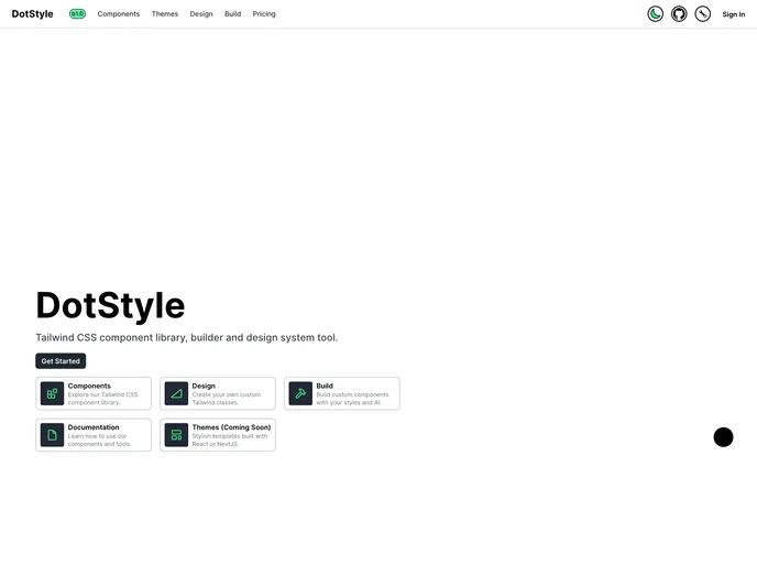
DotStyle is an open-source project that fuses the power of React and Tailwind CSS to create a collection of sleek, modern, and user-friendly components. It's perfect for developers looking to enhance their web applications with a stylish yet functional design. As it’s free to use, DotStyle makes high-quality design accessible to everyone, whether you are a seasoned developer or just starting.
The platform not only offers stunning components but also encourages community involvement. With clear guidelines for contributions, DotStyle promotes collaboration and continuous improvement. Whether you want to report bugs, suggest enhancements, or contribute code, DotStyle provides the appropriate channels to make an impact.
Features
-
Modern Design: Leverage sleek and contemporary components designed to elevate your web application's visual appeal.
-
Open Source: Enjoy the benefits of a completely free and open-source library, allowing for widespread usage and community contributions.
-
Built with React and Tailwind CSS: Harness the power of two of the most popular frameworks in web development for a seamless integration experience.
-
Easy to Use: Designed with developers in mind, DotStyle components are simple to implement, saving you time and effort.
-
Community Contributions Welcome: Participate in the growth of DotStyle by reporting bugs, suggesting enhancements, or submitting your code improvements.
-
Documentation Support: Follow clear contribution guidelines to easily collaborate, making it accessible for both newcomers and experienced developers.
-
Active Issue Tracking: Utilize GitHub's issue tracker to report problems or share suggestions, ensuring timely support and ongoing enhancements to the project.
- React
React is a widely used JavaScript library for building user interfaces and single-page applications. It follows a component-based architecture and uses a virtual DOM to efficiently update and render UI components
- Tailwind
Tailwind CSS is a utility-first CSS framework that provides pre-defined classes for building responsive and customizable user interfaces.
- UI Kits & Components

A UI kit provides developers with a set of reusable components that can be easily integrated into a website or application. These components are pre-designed with consistent styling and functionality, allowing developers to save time and effort in the design and development process. UI kits can be either custom-built or third-party, and often include components for buttons, forms, typography, icons, and more.