Components UI
React UI Components Library
Overview
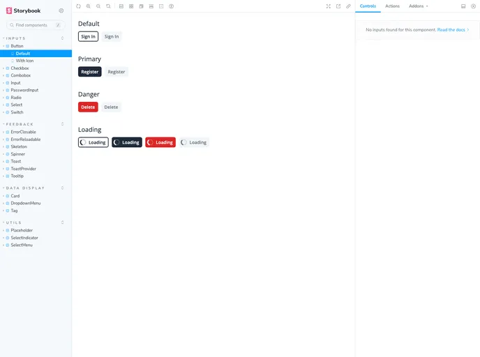
The UI Components Library is a React-based library that utilizes TailwindCSS and Zagfor to provide a set of user interface components for use in personal projects. The library aims to offer a combination of the popular React framework with the ease and flexibility of TailwindCSS and Zagfor. While there is no official documentation for the library, there are examples available in Storybook.
Features
- Built with React: The library is built using the React framework, allowing for the creation of reusable and interactive UI components.
- TailwindCSS Integration: TailwindCSS is incorporated into the library, enabling easy styling and customization of components using utility classes.
- Zagfor Compatibility: The library is designed to be compatible with Zagfor, a tool that enhances the developer experience with React and TailwindCSS.
Summary
The UI Components Library is a React-based library that integrates TailwindCSS and Zagfor to provide a collection of UI components for personal projects. It offers the convenience of React, the flexibility of TailwindCSS, and compatibility with Zagfor. Although there is no official documentation available, developers can find examples of the library's components in Storybook.