Svelte Dark Mode
Support dark mode in your Svelte apps
Overview
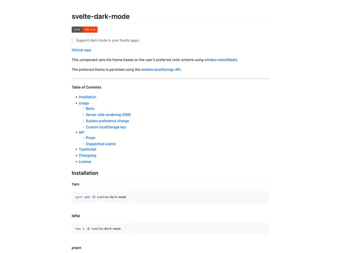
The Svelte Dark Mode component allows developers to support dark mode in their Svelte apps. It sets the theme of the app based on the user's preferred color scheme using the window.matchMedia function. The preferred theme is persisted using the window.localStorage API.
Features
- Supports Dark Mode: Sets the theme based on the user's preferred color scheme.
- Persistence: The preferred theme is persisted using the
window.localStorageAPI. - Server-side Rendering (SSR) Support: Provides guidance on accessing
document.bodyordocument.documentElementin SSR scenarios. - System Preference Change: Automatically updates the theme if the user changes their color scheme preference at the system level.
- Custom LocalStorage Key: Allows customization of the local storage key used to track the persisted theme.
- Dispatched Events: Dispatches an event when the theme is updated.
Summary
The Svelte Dark Mode component is a useful tool for Svelte developers looking to support dark mode in their applications. It offers several key features, such as support for system preference changes, customizability, and persistence of the preferred theme. By following the installation steps, developers can easily integrate the component into their Svelte apps and provide a seamless dark mode experience for their users.
- Svelte
Svelte is a modern front-end framework that compiles your code at build time, resulting in smaller and faster applications. It uses a reactive approach to update the DOM, allowing for high performance and a smoother user experience.
- Templates & Themes

A template or theme refers to a pre-designed layout or structure that provides a basic framework for building a specific type of application or website. It typically includes good design, placeholder content and functional features, allowing developers to customize and fill in the details according to their specific needs.
- Dark Mode
Dark mode is a user interface option that uses a dark color scheme instead of light. It reduces eye strain and improves visibility in low-light conditions. Implementing dark mode in a website or application involves updating the styles and color palette to support both light and dark modes.
- Typescript

TypeScript is a superset of JavaScript, providing optional static typing, classes, interfaces, and other features that help developers write more maintainable and scalable code. TypeScript's static typing system can catch errors at compile-time, making it easier to build and maintain large applications.