Design System
A Storybook project for UI development of React components for the MetaBrainz projects
Overview:
The MetaBrainz Design System is a comprehensive collection of React components, colors, icons, and layouts that serves as a centralized resource for developers and designers working on MetaBrainz projects. It is designed to simplify the process of building user interfaces with consistent design patterns. The design system is still a work in progress and aims to be a single source of truth for all UI-related aspects of MetaBrainz projects.
Features:
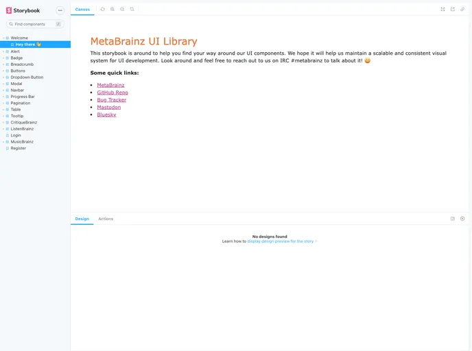
- Storybook for UI component development and auto-generated docs: The design system includes Storybook, a tool that enables the development and documentation of UI components in a declarative and component-centric manner.
- React declarative component-centric UI: The MetaBrainz Design System utilizes React to create reusable and declarative UI components, promoting a component-centric approach to UI development.
- NPM for packaging and distribution: The design system is packaged and distributed through the NPM platform, allowing for easy integration and accessibility for developers.
- GitHub Actions Continuous Integration: The design system leverages GitHub Actions as a continuous integration tool to facilitate the development and maintenance process, ensuring the reliability and stability of the components.
Summary:
The MetaBrainz Design System is a robust collection of UI components, colors, icons, and layouts that serves as a central resource for developers and designers working on MetaBrainz projects. By providing a single source of truth and utilizing technologies like React and NPM, the design system simplifies the process of building UIs with consistent design patterns. With features such as Storybook and GitHub Actions, it offers developers a comprehensive toolkit for UI component development and maintenance.
- React
React is a widely used JavaScript library for building user interfaces and single-page applications. It follows a component-based architecture and uses a virtual DOM to efficiently update and render UI components
- Bootstrap
Bootstrap is the most popular CSS Framework for developing responsive and mobile-first websites.
- SCSS
SCSS is a preprocessor scripting language that extends the capabilities of CSS by adding features such as variables, nesting, and mixins. It allows developers to write more efficient and maintainable CSS code, and helps to streamline the development process by reducing repetition and increasing reusability.
- UI Kits & Components

A UI kit provides developers with a set of reusable components that can be easily integrated into a website or application. These components are pre-designed with consistent styling and functionality, allowing developers to save time and effort in the design and development process. UI kits can be either custom-built or third-party, and often include components for buttons, forms, typography, icons, and more.
- Eslint

ESLint is a linter for JavaScript that analyzes code to detect and report on potential problems and errors, as well as enforce consistent code style and best practices, helping developers to write cleaner, more maintainable code.
- Postcss

PostCSS is a popular open-source tool that enables web developers to transform CSS styles with JavaScript plugins. It allows for efficient processing of CSS styles, from applying vendor prefixes to improving browser compatibility, ultimately resulting in cleaner, faster, and more maintainable code.
- Storybook
Storybook is a tool for developing and testing UI components in isolation. It provides a sandbox environment where you can experiment with different props and states to see how your component responds.
- Webpack

Webpack is a popular open-source module bundler for JavaScript applications that bundles and optimizes the code and its dependencies for production-ready deployment. It can also be used to transform other types of assets such as CSS, images, and fonts.