Reactro UI
A retro-inspired React component library with Typescript support
Overview
Reactro UI is a retro-inspired React component library with Typescript support. It provides a collection of components that can be easily integrated into any React project.
Features
- Retro-Inspired Design: Reactro UI offers a unique retro-inspired design that adds a nostalgic touch to your React applications.
- Typescript Support: The library is built with Typescript, allowing for better type safety and code predictability.
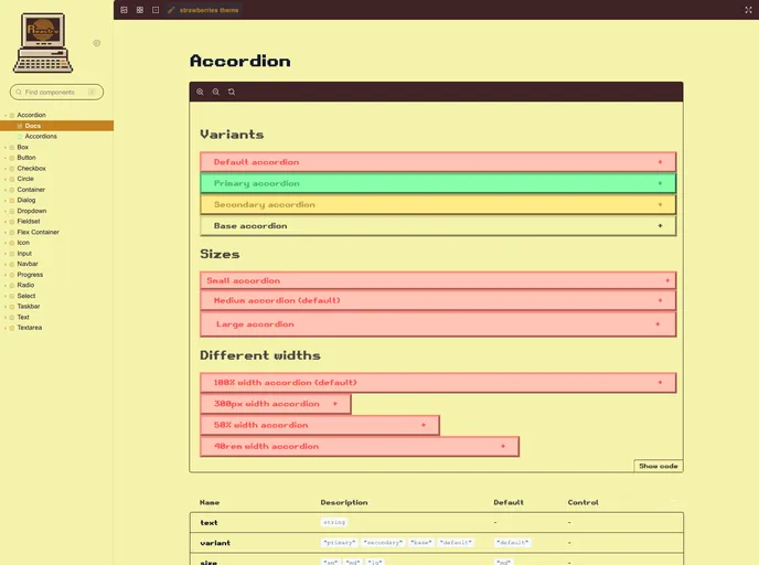
- Storybook Integration: Reactro UI provides a Storybook integration, giving you a comprehensive overview of all the available components in the library.
Usage
Once Reactro UI is installed, you can start importing and using its components in your React project. Follow these steps to get started:
- Import the desired Reactro UI component into your project.
- Wrap your entire application with the
ThemeProvidercomponent provided by Reactro UI. This ensures that the correct theming and styling are applied. ThemeProvideraccepts two props,themeandfont, where you can choose from the available themes and fonts provided by Reactro UI.
Summary
Reactro UI is a retro-inspired React component library that offers Typescript support and a variety of pre-built components. With easy installation and integration, it allows developers to quickly add a nostalgic flair to their React applications.
- React
React is a widely used JavaScript library for building user interfaces and single-page applications. It follows a component-based architecture and uses a virtual DOM to efficiently update and render UI components
- Styled Components
Styled Components is a popular library for styling React components using CSS syntax. It allows you to write CSS in your JavaScript code, making it easier to create dynamic styles that are specific to each component.
- UI Kits & Components

A UI kit provides developers with a set of reusable components that can be easily integrated into a website or application. These components are pre-designed with consistent styling and functionality, allowing developers to save time and effort in the design and development process. UI kits can be either custom-built or third-party, and often include components for buttons, forms, typography, icons, and more.
- Rollup

RollupJS is a popular and efficient JavaScript module bundler that takes the code from multiple modules and packages them into a single optimized file, minimizing the overall size of the application and improving its performance.
- Storybook
Storybook is a tool for developing and testing UI components in isolation. It provides a sandbox environment where you can experiment with different props and states to see how your component responds.
- Typescript

TypeScript is a superset of JavaScript, providing optional static typing, classes, interfaces, and other features that help developers write more maintainable and scalable code. TypeScript's static typing system can catch errors at compile-time, making it easier to build and maintain large applications.