Medly Components
Medly components provides numerous themable react components, each with multiple varitaions of sizes, colors, position etc.
Overview
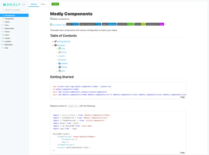
Medly Components is a versatile component library designed for React applications, providing a dynamic and customizable suite of components to streamline your development process. With a focus on modular design, it allows developers to quickly assemble user interfaces that meet their unique needs. Whether you're building forms, layouts, or incorporating icons, Medly's offerings cover a broad spectrum of use cases, making it a valuable tool for both novice and experienced developers.
The library is built with modern technologies such as React, TypeScript, and styled-components, facilitating a seamless integration into any project. Equipped with comprehensive documentation, including a Storybook for visualization, Medly Components simplifies the creation of beautiful and functional web applications.
Features
- Core Package: Includes essential components like Avatar, Button, Input, and Modal to kickstart any application.
- Forms Package: Create dynamic forms effortlessly using simple JSON configurations, enhancing user input management.
- Icons Package: Access a collection of commonly used SVG icons that are packaged as React components for easy usage.
- Layout Package: Design page layouts using versatile components, allowing for customized side panels and navigation structures.
- Loaders Package: Utilize simple SVG loaders that are easily integrable into your applications, improving user experience during content loading.
- Markdown Package: Use a straightforward syntax guide to format content efficiently, making text presentation effortless.
- Theme Package: Customize the overall look and feel of components individually, providing flexibility in design aesthetics while maintaining consistency.
- Utils Package: Employ various helpful utility functions, such as string manipulations, that simplify common tasks in development.
- React
React is a widely used JavaScript library for building user interfaces and single-page applications. It follows a component-based architecture and uses a virtual DOM to efficiently update and render UI components
- Styled Components
Styled Components is a popular library for styling React components using CSS syntax. It allows you to write CSS in your JavaScript code, making it easier to create dynamic styles that are specific to each component.
- MDX

MDX is a format that allows developers to write JSX within Markdown documents, combining the power of React with the simplicity of Markdown. This allows for the creation of dynamic and interactive content that can be easily shared and consumed across different platforms and devices.
- Storybook
Storybook is a tool for developing and testing UI components in isolation. It provides a sandbox environment where you can experiment with different props and states to see how your component responds.
- Typescript

TypeScript is a superset of JavaScript, providing optional static typing, classes, interfaces, and other features that help developers write more maintainable and scalable code. TypeScript's static typing system can catch errors at compile-time, making it easier to build and maintain large applications.
- Webpack

Webpack is a popular open-source module bundler for JavaScript applications that bundles and optimizes the code and its dependencies for production-ready deployment. It can also be used to transform other types of assets such as CSS, images, and fonts.