Adaptive Images
Automatically adapts your existing HTML images for mobile devices. No mark-up changes needed.
Overview
Adaptive Images is an innovative solution designed to enhance the web experience by seamlessly optimizing HTML images for mobile devices. In today's world where mobile browsing is predominant, ensuring that images load quickly and appear correctly on varying screen sizes is crucial. This tool allows web developers to achieve that without any significant changes to their existing markup, making it a convenient choice for those looking to improve their site's performance.
The technology behind Adaptive Images focuses on automatically adjusting images to suit the device being used, which not only improves loading times but also ensures better visual quality across devices. By implementing this solution, website owners can enhance user experience, retention, and overall engagement on their mobile pages.
Features
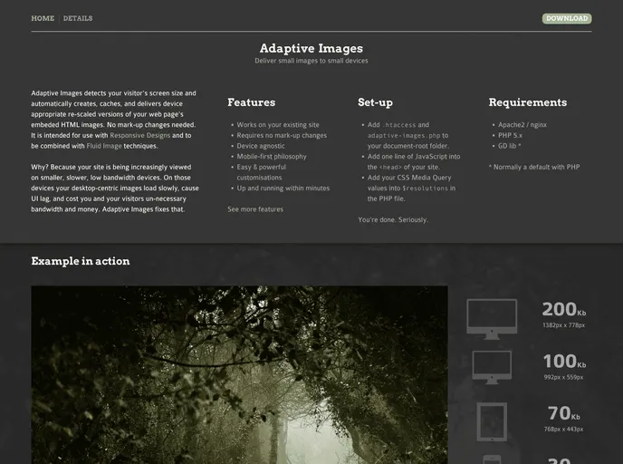
- Automatic Adaptation: Images are automatically scaled to match the screen resolution of the device, ensuring optimal display without manual adjustments.
- No Markup Changes Required: You can implement Adaptive Images without altering your existing HTML structure, saving time and reducing complexity.
- Improved Load Times: By serving appropriately sized images, the tool significantly enhances page load speed, which is essential for maintaining user engagement.
- Responsive Design Compatibility: Works seamlessly with responsive designs, supporting a variety of screen sizes from mobile phones to tablets and desktops.
- Enhanced Visual Quality: Ensures that images retain clarity and detail, providing a better visual experience for users on all devices.
- Simplified Integration: Easy to set up and integrate into existing projects, making it accessible for developers of all skill levels.
- Reduced Bandwidth Usage: Optimizing image sizes helps reduce the amount of bandwidth used, which can be especially beneficial for users with limited data plans.