Responsive Design Testing
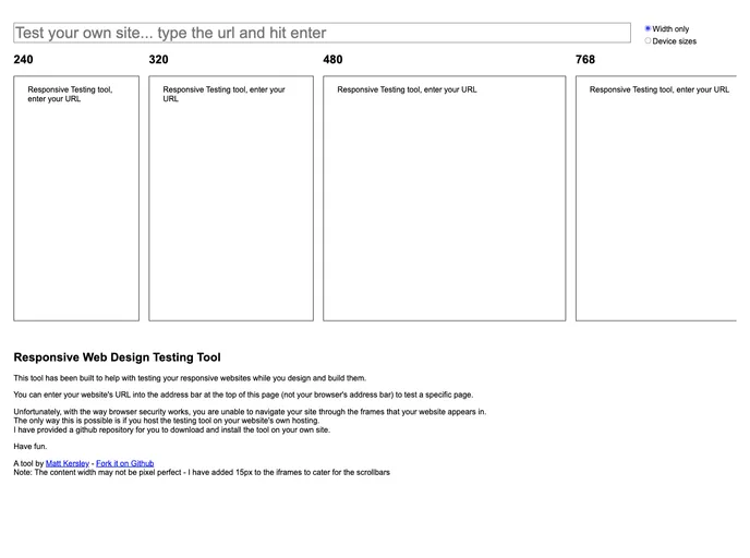
A simple HTML page to test out your responsive web design
Overview
Responsive Design Testing is an innovative tool that allows web designers and developers to evaluate how their web pages perform across different devices and screen sizes. With the ever-increasing variety of devices, ensuring that your website is responsive and user-friendly is more important than ever. This tool simplifies the process, helping you to identify and fix layout issues quickly.
This HTML page serves as a basic yet effective platform for testing your responsive web design. By utilizing this tool, you can gain insights into how your site looks and functions on various screen resolutions, allowing for a more streamlined user experience.
Features
- User-Friendly Interface: The design of the tool is straightforward, making it easy for anyone to use, regardless of technical expertise.
- Cross-Device Testing: This feature allows you to view and test how your web pages render on different devices, from smartphones to tablets and desktops.
- Quick Adjustments: Make immediate changes and see the results in real-time, streamlining your design process.
- Comprehensive Metadata Support: The tool incorporates helpful metadata to enhance your design testing experience.
- Customizable Viewports: Users have the option to select from various preset viewport sizes or input custom dimensions for precise testing.
- Performance Insights: Gain insights on how responsive changes impact load times and overall performance across devices.
- Browser Compatibility: The tool helps ensure that your responsive designs work seamlessly across different browsers, improving accessibility for all users.