Automad Bulma
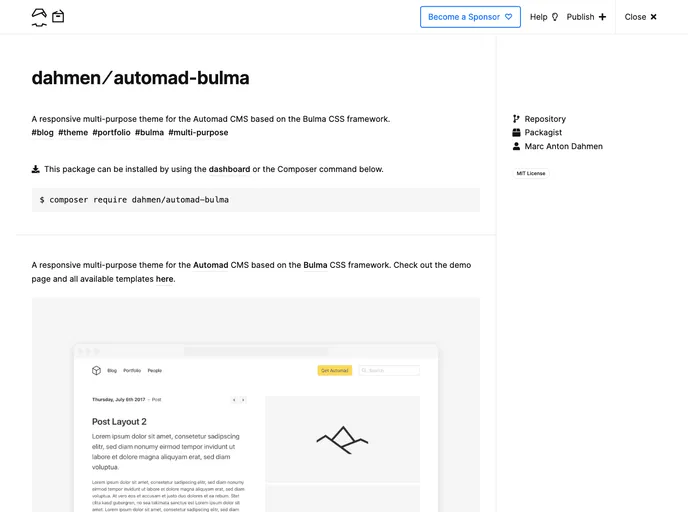
A responsive multi-purpose theme for the Automad CMS based on the Bulma CSS framework
Overview
The Automad Bulma Theme is an innovative and versatile template designed for the Automad CMS, leveraging the power of the popular Bulma CSS framework. This theme caters to users looking for a markdown-only solution that adapts seamlessly to a variety of website needs. Its responsive design ensures that your content looks great on any device, while offering a range of customization options to personalize the look and feel of your site.
With an emphasis on usability and aesthetics, the Automad Bulma Theme allows users to effortlessly implement stylish features and configurations without needing extensive coding knowledge. Whether you're creating a blog, portfolio or any other type of website, this theme provides a solid foundation to showcase your content dynamically.
Features
-
Custom Bulma CSS: Tailor the theme's design by uploading a customized version of the Bulma CSS framework to align with your brand identity.
-
Styling Hero Content: Easily enhance your hero banner with text or HTML markup, utilizing Bulma elements and modifiers for a professional appearance.
-
Hero and Navbar Settings: Control various visual aspects of the hero section and navbar with checkboxes to adjust opacity, logo size, and menu placement.
-
Slideshow Images: Create visually appealing hero sections or carousels by defining a set of images using flexible file patterns.
-
Search Functionality: Enable a search field in the navbar that can direct users to your results page, ensuring easy navigation through your content.
-
Navbar Action Button: Highlight key actions on your site with an actionable button in the navbar that links to either internal or external pages.
-
Sorting Pagelists: Customize the order of your page lists with a simple configuration, allowing for more control over how content is presented.
-
Open Graph Integration: Automatically generate open graph tags for enhanced sharing, with options to customize the preview image for better visibility on social media.
- Bulma
Bulma is a free, open source CSS framework based on Flexbox and built with Sass. It's 100% responsive, fully modular, and available for free.
- Templates & Themes

A template or theme refers to a pre-designed layout or structure that provides a basic framework for building a specific type of application or website. It typically includes good design, placeholder content and functional features, allowing developers to customize and fill in the details according to their specific needs.