React Showroom
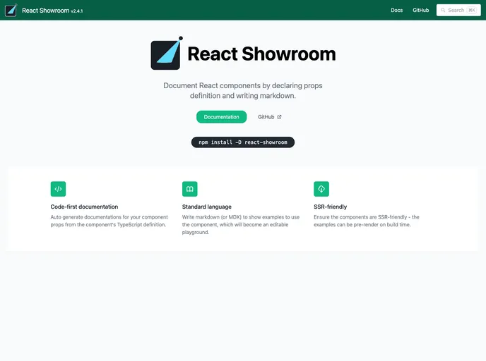
Document React components by declaring props definition and writing markdown.
Overview:
The React Showroom is a tool that allows you to document and showcase your React components. It helps you generate documentation for your component props, write examples to demonstrate component usage, and provides an editable playground. The Showroom also supports multiple languages for live examples and allows for collaboration by allowing code editing and commenting with shareable URLs. It ensures that your components are SSR-friendly and can be pre-rendered during build time.
Features:
- Auto generate documentations for component props from TypeScript definitions
- Write markdown to show examples and create an editable playground
- Auto generate props control/knobs based on component props type definitions
- Support for multiple languages in live examples: TypeScript (TSX and TS), JavaScript (JSX and JS), and HTML
- Collaboration enhancement through code editing and commenting with shareable URLs
- SSR-friendly components with pre-rendering capability
Example Usage
<MyButton label="Click Me" />
`}
## Summary:

React Showroom is a tool that simplifies the process of documenting and showcasing React components. It provides automatic generation of component prop documentation, an editable playground, and collaboration features. By allowing you to write documentation in a more stable medium like markdown, it gives you more freedom and flexibility to migrate to alternative tools in the future. The tool is easy to install and integrate into your existing workflow, allowing you to focus on developing and documenting your components efficiently.
- React
React is a widely used JavaScript library for building user interfaces and single-page applications. It follows a component-based architecture and uses a virtual DOM to efficiently update and render UI components
- Tailwind
Tailwind CSS is a utility-first CSS framework that provides pre-defined classes for building responsive and customizable user interfaces.
- UI Kits & Components

A UI kit provides developers with a set of reusable components that can be easily integrated into a website or application. These components are pre-designed with consistent styling and functionality, allowing developers to save time and effort in the design and development process. UI kits can be either custom-built or third-party, and often include components for buttons, forms, typography, icons, and more.
- Eslint

ESLint is a linter for JavaScript that analyzes code to detect and report on potential problems and errors, as well as enforce consistent code style and best practices, helping developers to write cleaner, more maintainable code.
- Rollup

RollupJS is a popular and efficient JavaScript module bundler that takes the code from multiple modules and packages them into a single optimized file, minimizing the overall size of the application and improving its performance.
- Typescript

TypeScript is a superset of JavaScript, providing optional static typing, classes, interfaces, and other features that help developers write more maintainable and scalable code. TypeScript's static typing system can catch errors at compile-time, making it easier to build and maintain large applications.