Gulp Responsive
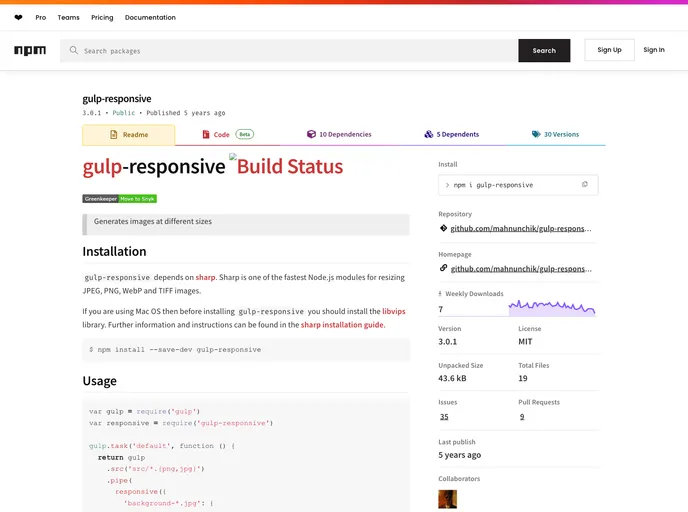
gulp-responsive generates images at different sizes
Overview:
The gulp-responsive is a Node.js module that generates images at different sizes by utilizing the sharp library for resizing JPEG, PNG, WebP, and TIFF images. It is particularly efficient for handling image resizing tasks quickly. Users on Mac OS need to ensure the libvips library is installed before using gulp-responsive.
Features:
- Fast Image Resizing: Utilizes the sharp library for fast resizing of images in various formats.
- Multiple Configurations: Allows for setting multiple configurations for resizing images.
- Quality Settings: Provides options to adjust the output quality for different image formats.
- Support for Different Image Formats: Supports resizing for JPEG, PNG, WebP, and TIFF images.
- Advanced Resizing Options: Offers options for cropping, embedding, ignoring aspect ratio, and more.
- Integration Support: Can be integrated with HTML srcset attribute, <picture> element, and CSS image-set method.
Summary:
The gulp-responsive Node.js module, built on the sharp library, enables users to efficiently resize images in various formats. With support for multiple configurations, quality adjustments, and advanced resizing options, gulp-responsive provides a versatile solution for handling image resizing tasks. Installation instructions, including the necessary dependencies, are provided for a seamless setup process.
- Gulp

Gulp.js is an old but popular site building tool that automates various repetitive development tasks in web development, such as compiling Sass, minifying JavaScript, and optimizing images.