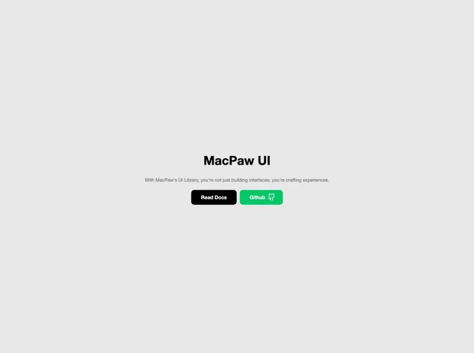
Macpaw UI
UI Kit for MacPaw Web Projects
Overview
The macpaw-ui is a user interface library that provides pre-designed components and styles for developers to use in their web applications. It offers a range of features that make it easy to create visually appealing and functional interfaces.
Features
- Easy installation: The macpaw-ui can be installed with npm or yarn, making it simple for developers to add it to their project.
- Component integration: Developers can easily integrate new components into their project by adding the JSX and styles to the appropriate directory.
- Icon customization: Icons included in the macpaw-ui library can be customized with dynamic fill attributes, allowing for easy changes and overrides in CSS or React components.
- Version control: The macpaw-ui uses Github Actions to publish package updates, making it easy for developers to track and manage versions.
- Responsive design: The macpaw-ui components are designed to be responsive, ensuring a consistent experience across different devices and screen sizes.
Summary
The macpaw-ui is a comprehensive user interface library that offers a range of features for developers. With easy installation, component integration, icon customization, and version control, it provides developers with the tools they need to create visually appealing and functional web applications.
- Next.js
Next.js is a React-based web framework that enables server-side rendering, static site generation, and other powerful features for building modern web applications.
- React
React is a widely used JavaScript library for building user interfaces and single-page applications. It follows a component-based architecture and uses a virtual DOM to efficiently update and render UI components
- SCSS
SCSS is a preprocessor scripting language that extends the capabilities of CSS by adding features such as variables, nesting, and mixins. It allows developers to write more efficient and maintainable CSS code, and helps to streamline the development process by reducing repetition and increasing reusability.
- UI Kits & Components

A UI kit provides developers with a set of reusable components that can be easily integrated into a website or application. These components are pre-designed with consistent styling and functionality, allowing developers to save time and effort in the design and development process. UI kits can be either custom-built or third-party, and often include components for buttons, forms, typography, icons, and more.
- Eslint

ESLint is a linter for JavaScript that analyzes code to detect and report on potential problems and errors, as well as enforce consistent code style and best practices, helping developers to write cleaner, more maintainable code.
- MDX

MDX is a format that allows developers to write JSX within Markdown documents, combining the power of React with the simplicity of Markdown. This allows for the creation of dynamic and interactive content that can be easily shared and consumed across different platforms and devices.
- Typescript

TypeScript is a superset of JavaScript, providing optional static typing, classes, interfaces, and other features that help developers write more maintainable and scalable code. TypeScript's static typing system can catch errors at compile-time, making it easier to build and maintain large applications.